May 25, 2018

Back to reality: Layered Land

The land at the border between Denmark and Germany is so flat that it's hard to get more than a few thin layers of colors when you look towards the horizon. Look at the following image (or even better: click through to the large(r)  original) to see what I mean:

DSC_41891.jpg

By the way: that is not a pano composite from multiple shots but simply a 8228 x 2185 pixel crop from a single shot at 92mm focal length.
Here you can nicely see all the layers from blue water at the bottom through dark yellow + dark green + yellow from the reed, then the light green from the meadow up to the light blue of the sky. Fascinating, flat but fascinating.

May 24, 2018

Vertical panning

Many associate panning with a horizontal movement. And there indeed exist a lot of long-exposure images esp. of land- and seascapes that blur the horizontal areas of sky, sea and beach into colorful stripes - more or less devoid of any structure. There are some impressive photos of this type out there but many of them I find lacking in structure/texture.
At the workshop I experimented with both horizontal and vertical panning but stuck to a relatively short exposure (around 1/4 - 1/2 sec) and also tried to have a short period of holding the camera still before starting the pan. I wanted to get at least some overlay of better defined structure over the blurred "background". With such short exposure you better move swiftly and the results have quite some variation. That means you need lots of shots to get the results you want.
I also found that with vertical panning I get more definition in trees, grass, reed as their vertical structure is better preserved. Still I needed quite some postprocessing with all the panning shots I did to recover contrast/pop and structure.
Well, enough words, here are some of the results…

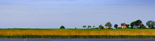
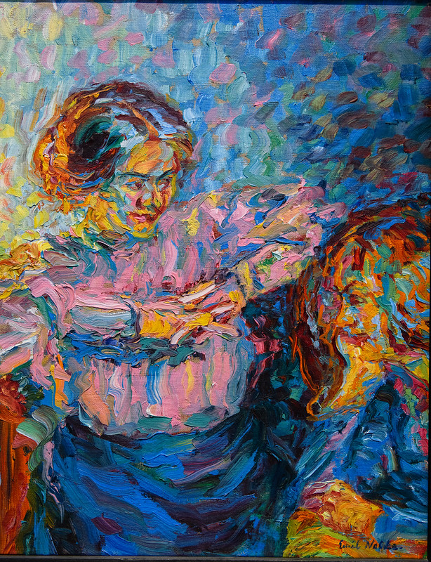
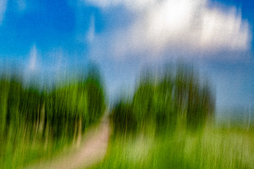
First up a 0.4 sec shot which retains quite a lot of detail:

DSC_42135.jpg

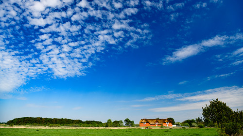
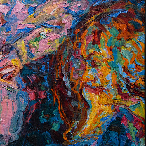
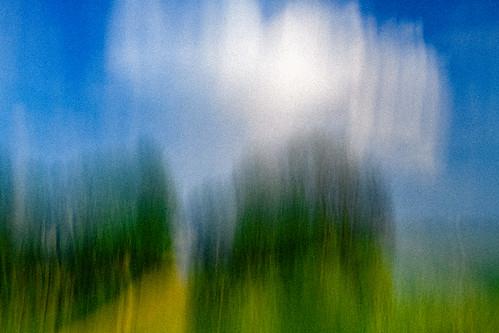
The same location at 1/4 sec but with a faster pan produces longer strokes from the bushes and trees making the scene a bit more abstract:

DSC_42130.jpg

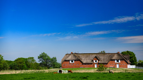
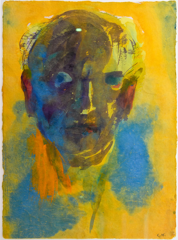
In both images I used a pretty strong grain (click through the images to see the larg(er) originals). It sort of "fixes the color to the canvas" and helps to mellow down the strokes which sometimes can look quite aggressive/scratchy.
You can perhaps see some of the "scratchiness" in the following shot:

DSC_42050.jpg

May 22, 2018

What, no Emil-Nolde-Weather?

The next day of the workshop was dedicated to landscape photography. We started with a photo-walk from the Nolde Museum to a nearby lake and in the afternoon transferred to the North Sea hoping to capture a dramatic sunset.
But alas! The sky was blue and the high cirrus clouds did not look promising. As Heinz Teufel said: Emil Nolde wouldn't have gone painting landscapes on a day like this.
Well, we had to work with what we've got so here's my first try to capture the flat landscape:

DSC_41837.jpg

The farm house is one of those often captured in Emil Nolde's paintings.
I used a polarizer and did quite some color-pushing in post to produce at least some expressionistic colors. But certainly this is not a model of a "dramatic" sky.
Still the shot captures the vast landscape under the endless sky quite well.

Here's a closer view of the same farm house:

DSC_41843.jpg

As always: click through the images to enjoy the large view.

May 21, 2018

Emil Nolde and Photography?

Disclaimer: This is NOT about emulating Emil Nolde but about being inspired by his ideas!

When you look at Emil Nolde's work it's pretty hard to make the connection between his ideas/paintings and their relevance for photography. But what inspired me most are his brilliant expressive colors and his dissolution of lines and surfaces with his brush strokes - and how he gave life to the pretty flat landscape of northern Germany. But that'll be the topic of another post...
So there I was at Heinz Teufel's workshop thinking about what to extract from the great painter's "vision" and how to put it at work in my photography. As the first day of the workshop was dedicated to shooting flowers it was easy to get the expressive colors that Nolde is so famous for. And the dissolution of reality ("abstractification" ;-) comes with the shallow depth of field that is so typical for macro photography.
So here goes:

DSC_41575.jpg

Or this one with the colorful petals reminding me of broad strokes on a canvas:

DSC_41636.jpg

Click through the image to get to the large original.

Hope you like it!

May 20, 2018

The Stroke of a Genius

Kit White proclaimed in his "101 Things to Learn in Art School": "A painting should be satisfying at a distance of both twelve inches and twelve feet". Now look at Noldes image reproduced pretty small here due to the limited width of 500 pixel, so somewhat akin to "12 feet" away:


Emil_Nolde_41722.jpg

Beautiful portrait of a lady sitting on a chair or couch in the warm afternoon light - until you recognize the second young lady sitting opposite to her. I really had my moment of slow reveal here as I did not immediately realize there was a second face in the image. Perhaps I was too close to the painting admiring the brush strokes of the genius Emil Nolde.
Here is a close-up of the face on the right and I really urge you to click through the image and have a good look on the large version of that crop to get an almost life-like impression of being "12 inches" away:


Emil_Nolde_41723.jpg

Simply marvelous!

May 19, 2018

Visit Emil Nolde Museum!

Coming back from a visit to the Emil Nolde Museum in Seebüll (www.nolde-stiftung.de) I can only say "Wow!" It is not a large museum and can only show a small part of all the work Emil Nolde did (1100 oil paintings alone) but they do a very good job in picking interesting pieces like the following portrait:

Emil_Nolde_41680.jpg

See a selection of the paintings currently on display in the museum: My flickr album
These are NOT faithful reproductions but I processed them to capture the images as best as I remember.
Hope you like them!

May 07, 2018

Preparing for Emil Nolde

With a photography workshop at Nolde's garden coming up, I've been reviving my idea of painterly effects. I was experimenting with layering sharp shots onto unsharp shots of the same subject in Photoshop when I ended up with the following result of a Geranium flower (best viewed large!):

Geranium_41405

I pretty much like the combination.
This is without any "post-merge" processing, but you can still bring more detail of the flower to the fore, if you wish.

May 03, 2018

Back to orchids

I finally decided to make the following image my favorite when i was playing with Adobes new profiles. This led me to dissolve the contours of the flower even more radically leaving the color blotches like the mask of a Kabuki actor.

Kabuki_13181

Hope you like it.