It is not only with the more abstractified type of photography that the question arises of how much of the perception of an image is driven by the viewer. But the more abstract a photography is the larger the role of the viewer is: his imagination, his experience, his current state of mind.
The more explicit an image is the less is left to the imagination of the viewer.
Surfing around I stumbled across an essay by the photographer Minor White on what Alfred Stieglitz and others called "Equivalence". You can read Minor White's essay here.
As the perception of "Equivalence" relies solely on the imagination of the viewer there must be different classes of viewers out there. And some which Minor White was not very fond of: "And we observe that all too often the persons who cry "Sick, Sick, Sick" have no imagination. Or, for reasons obscure to them, they deliberately blind themselves to visual experiences that might disturb their basic insecurity."
When reading his comments I started to think of whether they might be still valid as of today, more than 50 years later. Well, I think the flood of images now molding current viewers is still mostly non-abstract - so abstract images might still be hard to grasp for todays average recipients.
But that is my honest opinion - and open to debate. I'd love to hear your commentaries on this topic!
December 28, 2010
December 26, 2010
Surreal = not quite real?
Well I thought I looked quite astonished when I stumbled across this wedding scene:

The photographer was shooting the kissing couple while behind him some (un)invited guests were serenely watching. What a hilarious scene this was!
I raised my camera and found out that didn't have anything longer than a lowly 35mm lens mounted and - as I didn't want to intrude - had to make do with the equipment at hand. Fortunately the "normal" lens and a little cropping were enough to capture the surreal flavor of this vista - my first wedding shot!
According to Wikipedia "Surreal in general means bizarre or dreamlike". So I claim that this image has a place right here, although it is not "abstract" - but it is "not quite real" either.
December 14, 2010
White Wine with the Fish?
This is absurd: You're looking at some random abstract figure and imagine seeing things! I imagined seeing a fish in this rust-image I captured the other day when visiting one of my favorite subjects in the vicinity: a derelict rusty old excavator.
As always with rusty material you don't need much to get crazy colors not only in the oranges but also in the blues:
Fish:

Interestingly I captured this image after having been there many times before. So it always pays to revisit certain locations again and again to cover all the possibilities...
As always with rusty material you don't need much to get crazy colors not only in the oranges but also in the blues:
Fish:
Interestingly I captured this image after having been there many times before. So it always pays to revisit certain locations again and again to cover all the possibilities...
December 07, 2010
Black (and white) Sunflower
I captured another view in this sunflower field. This time of two single flowers. I went for a b&w conversion - just out of gut feeling.

December 05, 2010
Chaos
I was standing in front of this field of snow-capped sunflowers wondering whether I could produce an image that conveyed the decay of the flowers, the jumble of their stalks, and the eerie atmosphere of a field of flowers that belong to summer shivering in the cold of winter. I made a lot of shots, naturally also with close-ups of single flowers, but I found the visual chaos of this specific shot fitting.
Sunflower Field:

In post I chose an amplification of the brown-reds and a yellowish tint for the snow which emphasized the drabness of the scene.
Best viewed at 1024 or 1920 width, so feel free to click through the image to the larger versions...
Sunflower Field:
In post I chose an amplification of the brown-reds and a yellowish tint for the snow which emphasized the drabness of the scene.
Best viewed at 1024 or 1920 width, so feel free to click through the image to the larger versions...
November 19, 2010
Fractured Urbania
There is a very interesting attempt at abstract photography over here called "Fractured Urbania". It is obviously inspired by David Hockney and it is the first of this kind that I've seen somewhere on a photography site. But that may be due to me not surfing enough ;-)

This image is copyright by Chris Heilman 2010. Click through the image for a larger version.
Chris wrote about his image: "A great deal of my photography is about photography. In this case [...] the photographs are overtly about construction of new, large scale urban development. Breaking the photograph up this way suggests impermanence, ... or what? an artificial facade? The picture is an expression of this."
I find it highly interesting but have no clue as to how it was produced. But I'm a little weary as to what is the goal of these images and how this goal is supported by this special technique. As I wrote in a commentary there: "In the case of both images above I'm a little unsure what the topic/theme of those images is. The consequence is that I have the feeling the technique is a little "l'art pour l'art" (if you excuse my French!)... But nice technique nonetheless." To which Chris answered. "This is not the first time I have heard this criticism of my work, and I accept that there is validity to it. Given that, I feel that my themes are perhaps too personally coded to be easily accessible."
I think his remark hits on an often recurring theme with photographs that are more than just snapshots or "postcards": What is the intention of the photographer behind or beyond what can readily be seen in the image?
November 11, 2010
Branching, Trees, Black & White
Coming back to one of my favorite subject: Trees.
Fractal structure, blending one typical macro form with different micro-structures they are fascinating all around the year.
So fall/winter is a good time to marvel about the inherent structure of trees, with the camouflage of the leaves gone, the colors stripped. Add to that some aggressive curves, catapulting any colors into either black or white and you reduced the tree(s) to some primeval forms.
I called it
Branching:
November 07, 2010
Black and White Cats
Back to black (and white). Those silhouettes against the evening sky just lent themselves to reach the first level of abstractification: a black&white conversion.
Plus the need for high shutter speed and a small aperture made a relatively high ISO of 800 necessary. Add in the tight crop plus cranked-up contrast added some gritty noise too - which btw. works better in b&w than in color imho.
Making those nice pussy-cats look like...
Daredevil & Calamity Jane;-)
November 02, 2010
Abstract Architecture?
Well, no. But architecture sometimes gives you material for interesting viewpoints, extreme perspective, or surprising crops that sets your image apart from what other people have seen there, on the street, with the building in plain sight.
Yesterday I was just standing there in front of this imposing granary building in Beilngries, Bavaria. Looking through my viewfinder, I was not hoping for much: Standard "from-the-street" perspective, and the front of the building looked bland. But tilting the camera and aligning the narrow but high windows along the diagonal something suddenly clicked - and so did my camera :)
Unfortunately the standard contrast development did nothing to show both the wooden shutters and the structure of the wall well, so I did some HDR development:
October 18, 2010
Back from testing
Phew, a lens with an almost 11x zoom-range is quite a challenge to test. Because the dangerous thing is that performance shifts back and forth when you zoom through the range. So I tested eight different focal length to do the lens justice. But that is now all over.
Coming back to shooting and processing I went for testing HDR Efex pro from Nik Software on bracketed shots and on single RAW files. I stumbled across an image from this year that I really wanted to add some punch to. Not that it is now very abstract, but the lines on the wall, the stark shadows and crass colors lift this image out of the "realistic" realm.
Skull:

Hope you enjoy it!
Coming back to shooting and processing I went for testing HDR Efex pro from Nik Software on bracketed shots and on single RAW files. I stumbled across an image from this year that I really wanted to add some punch to. Not that it is now very abstract, but the lines on the wall, the stark shadows and crass colors lift this image out of the "realistic" realm.
Skull:
Hope you enjoy it!
October 03, 2010
Testing, testing, testing...
If you wonder, why it's a little slow on my blog:
I'm currently testing the new Nikon AF-S VR 28-300 f/3.5-5.6. And at that focal range I'm testing 28/35/50/70/105/150/200/300mm at 6 different apertures on two different cameras (D300 and D700). This takes some time. But the impression so far is pretty good.
If you're interested in the results, have a look here. My other reviews of Nikon lenses can be accessed via this page.
September 11, 2010
Shadow, shadow on the wall...
I've already shown you an example of the abstractifying powers of shadows there.
Here is another example that conveniently combines abstractification through shadows and oof (and b&w / two-tone in the shadow if you like).
A rose:

The central "gap" through the image is perhaps a bit unfortunate, but as I could neither move the sun nor the rose to another point it had to stay there, separating the subject and its shadowy image...
Here is another example that conveniently combines abstractification through shadows and oof (and b&w / two-tone in the shadow if you like).
A rose:
The central "gap" through the image is perhaps a bit unfortunate, but as I could neither move the sun nor the rose to another point it had to stay there, separating the subject and its shadowy image...
September 06, 2010
Warped Reality
Mirrors are nice props to produce interesting images, reflecting the unexpected or combining different views into one image.
Warped mirrors (or to be precise mirroring surfaces) are even more fun to play with and are great reality modifiers. Just walk up to the chrome parts of a bike and watch with a photographers eye!
Here's one I captured recently, called
Warped Reality:

Warped mirrors (or to be precise mirroring surfaces) are even more fun to play with and are great reality modifiers. Just walk up to the chrome parts of a bike and watch with a photographers eye!
Here's one I captured recently, called
Warped Reality:
August 16, 2010
A Beech is a Beech is a Beech...
I love trees!
And we have some very impressive and old ones in the vicinity - mostly oaks and beeches.
But to capture the "true" impression of the tree is a real challenge: Often they are surrounded by other trees, the sky produces a strong contra-light while the bark is dark, exposure is critical, and lastly those trees are so huge that even large-aperture lenses cannot isolate them sufficiently.
In this shot I used a wide-angle (21mm film-equivalent) to capture the treetop and combined it with a very low vantage-point. This normally leads to an exaggerate perspective but as a tree is a three-dimensional subject which is as deep as it is wide you can still get a nicely balanced impression of the trunk and the canopy. The original capture was very dark, which quite nicely reflected the overcast and drizzly weather. I tried some exposure compensation but that only led to a glaring sky and a harsh and grainy bark - which totally defeated the original gloomy impression. So I went to some extreme curves trying to balance the bark, the leaves and the sky. This in turn introduced some false yellow, red and blue colors. I desaturated the blue as it looked simply strange and kept the yellow and red leaves as it added a touch of autumn. I also created some dreamy bark textures and ghost-like lighting effects on the trunk, which I found quite fitting for such an old, old tree.
So here is the result of some over-the-top post-processing to capture the "aura" of an old beech.
Psychedelic Beech:

And here is the original.
After the first 100 views I had only 2 comments on the forums: one favoring the "natural" version and one relating to the difficulties of capturing trees.
So you could consider the "Psychedelic Beech" a roaring failure!
What do you think?
And we have some very impressive and old ones in the vicinity - mostly oaks and beeches.
But to capture the "true" impression of the tree is a real challenge: Often they are surrounded by other trees, the sky produces a strong contra-light while the bark is dark, exposure is critical, and lastly those trees are so huge that even large-aperture lenses cannot isolate them sufficiently.
In this shot I used a wide-angle (21mm film-equivalent) to capture the treetop and combined it with a very low vantage-point. This normally leads to an exaggerate perspective but as a tree is a three-dimensional subject which is as deep as it is wide you can still get a nicely balanced impression of the trunk and the canopy. The original capture was very dark, which quite nicely reflected the overcast and drizzly weather. I tried some exposure compensation but that only led to a glaring sky and a harsh and grainy bark - which totally defeated the original gloomy impression. So I went to some extreme curves trying to balance the bark, the leaves and the sky. This in turn introduced some false yellow, red and blue colors. I desaturated the blue as it looked simply strange and kept the yellow and red leaves as it added a touch of autumn. I also created some dreamy bark textures and ghost-like lighting effects on the trunk, which I found quite fitting for such an old, old tree.
So here is the result of some over-the-top post-processing to capture the "aura" of an old beech.
Psychedelic Beech:
And here is the original.
After the first 100 views I had only 2 comments on the forums: one favoring the "natural" version and one relating to the difficulties of capturing trees.
So you could consider the "Psychedelic Beech" a roaring failure!
What do you think?
August 14, 2010
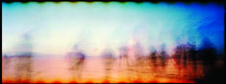
Ghosts
One of the entries to the "Blur" challenge at Nikongear caught my eye. The image is called
Ghosts:

This image is copyright by intruder61 2010. Click through the image for a larger version.
The image captured a high dynamic range scene with colorful elements. The blurring concentrates the image on the light/contrast and the colors as it takes away the details of the scene. The persons in the foreground appear as ghosts moving along.
A very nice example of what you can achieve with blurring.
Ghosts:
This image is copyright by intruder61 2010. Click through the image for a larger version.
The image captured a high dynamic range scene with colorful elements. The blurring concentrates the image on the light/contrast and the colors as it takes away the details of the scene. The persons in the foreground appear as ghosts moving along.
A very nice example of what you can achieve with blurring.
August 09, 2010
High Key Abstraction
Another fascinating image came up on Nikongear again. I got permission to show it here as a very nice example of high key abstraction. ....
Sea Urchin:

This image is copyright by Andrea G. Blum 2010. Click through the image for a larger version.
Andrea commented about her photo:
"I found the empty Sea Urchin shell on the granite slabs at Schoodic Point on the Atlantic Ocean in Acadia National Park in Maine. The gulls drop clams, crabs and urchins on the rocks to crack them open for a tasty snack. (Poor Urchin !!)
The urchin shell had such intricate designs both inside & out.
I made several documentary photos with my 60mm f2.8 AF-S Micro Nikkor, but something so beautiful deserved a more artistic, impressionistic approach.
I tried some multiple exposures and various extreme exposure and colour effects. This high-key abstraction made via an overexposure of the inside of the urchin shell (followed by a white/black point reset in the editor) pleased me the most. BTW, it is not obvious, but the greenish areas are from algae in a nearby tidal pool."
Not much "trickery" in here. Just an interesting subject (and naturally: the eye to identify it!) and the idea to abstractify it through over-exposure.
Comments welcome.
Sea Urchin:
This image is copyright by Andrea G. Blum 2010. Click through the image for a larger version.
Andrea commented about her photo:
"I found the empty Sea Urchin shell on the granite slabs at Schoodic Point on the Atlantic Ocean in Acadia National Park in Maine. The gulls drop clams, crabs and urchins on the rocks to crack them open for a tasty snack. (Poor Urchin !!)
The urchin shell had such intricate designs both inside & out.
I made several documentary photos with my 60mm f2.8 AF-S Micro Nikkor, but something so beautiful deserved a more artistic, impressionistic approach.
I tried some multiple exposures and various extreme exposure and colour effects. This high-key abstraction made via an overexposure of the inside of the urchin shell (followed by a white/black point reset in the editor) pleased me the most. BTW, it is not obvious, but the greenish areas are from algae in a nearby tidal pool."
Not much "trickery" in here. Just an interesting subject (and naturally: the eye to identify it!) and the idea to abstractify it through over-exposure.
Comments welcome.
August 06, 2010
Abstract Reality II
The other day I saw a very interesting image on Nikongear. I got permission to show it here as it is a very nice example of "abstract reality". It was captured as is, with none of the major techniques to abstractify a photo that I listed here.
Sego:

This image is copyright by James Fitzgerald, shot in 1982 on Ektachrome. Click through the image for a larger version and other shots from James.
This is what James told me about his photo:
"Even though it's 28 years old I remember clearly making this image. I've made many of this type of abstract image over the years.
When I looked at this old painted sign on the side of a building I saw more than just an old sign.
I saw the the muted pastel colours, the lines in the concrete, I saw the "S" from Sego mostly gone, was it scratched out? leaving the word ego?
I wondered, who made this?"
What do you need to capture abstract reality?
Well, simple: Just an eye for detail and a good sense of cropping/framing, methinks!
And this image serves as a reminder what a great abstractifier rust is!
Comments are welcome.
Sego:
This image is copyright by James Fitzgerald, shot in 1982 on Ektachrome. Click through the image for a larger version and other shots from James.
This is what James told me about his photo:
"Even though it's 28 years old I remember clearly making this image. I've made many of this type of abstract image over the years.
When I looked at this old painted sign on the side of a building I saw more than just an old sign.
I saw the the muted pastel colours, the lines in the concrete, I saw the "S" from Sego mostly gone, was it scratched out? leaving the word ego?
I wondered, who made this?"
What do you need to capture abstract reality?
Well, simple: Just an eye for detail and a good sense of cropping/framing, methinks!
And this image serves as a reminder what a great abstractifier rust is!
Comments are welcome.
August 01, 2010
Photomerge/RotoMerge: On the use of Tools
"RotoMerge" sounds like "Photomerge", a tool from Photoshop that lets you merge multiple images to achieve either panoramic images, HDR pictures or focus-stacks.
But I have not yet used the Photomerge-tool for any of my abstract work as I up to now have only used single exposure shots.
So far my post-processing is restricted to cropping, exposure correction, curves and color-tweaking. So the abstracticity of my images is captured in the making, at the moment of the shot. All post-processing is just like you normally would also do with a realistic photography.
It was only a few times so far when I used tools to change colors and contrast to an extend that you can speak of abstractifying. I did this with an images of clouds and flowers that I'll present in a future article.
But I still have the idea of using Photomerge to create some interesting abstract effects by stacking several photos from different perspectives together. But other than David Hockney I'm not thinking of making a big collage out of different photos but to merge them one over the other.
But so far my efforts have not resulted in anything useful :(
July 30, 2010
The Picture of Dorian Gray
"...it is a mistake to think that the passion one feels in creation is ever really shown in the work one creates. Art is always more abstract than we fancy. Form and colour tell us of form and colour - that is all."
(Quote from "The Picture of Dorian Gray" by Oscar Wilde, 1890)
I think this describes one of the most frustrating experiences every new photographer will have when they show their work around: Not everybody shares their enthusiasm for an image simply because the passion with (or in a wider sense: the context in) which the photo was taken was lost on the beholder.
There are two dangerous courses that result from such frustration:
- one tries to shoot what pleases the crowd; with the risk of becoming a copy-cat.
- one proclaims: "It is enough if I find this image beautiful" and risk to stop improving.
Both paths will not lead to the desired result: to evoke (or convey) feelings, or even passion through the artful use of form and color.
That inspires a nasty question: What is it in "abstract art" that evokes feelings?
I posted this on some forums but response was scarce. Someone ventured along the lines that something in the colors or forms of an abstract image evokes memories which are coupled with feelings. Perhaps not a bad guess. But that would mean that you as a photographer hardly have control over what feelings you evoke with abstract photos.
My theory is that abstract art relies more on the primary effectors of color and form. Like round forms are associated with the feminine, red is associated with warmth/love etc. You get my drift?
So it is indeed easier for the beholder to associate "things" with a more abstract image than with a very realistic, explicit photo that tunnels your thoughts quite strongly. Perhaps the same mechanism that makes many films of books a less satisfying experience for the reader of the book - because the explicit images in the film restrict the associations the reader of the book had or even contradict them.
So coming back to the quote from Oscar Wilde: It might just be a hint that the highest explicitness and realism in an image not necessarily evokes the most favorite response to it.
Erotic photography is certainly one example where this "insight" is considered a platitude.
And Bjørn Rørslett comes to mind with many intriguing images that are quite enigmatic. See for example his "Colours on Colours" gallery.
Anyone likes to comment?
---
Interesting reading: "OK... I just do not get it???"
July 28, 2010
The boone of the LCD-viewer
When I cursed the "transparency" of modern optical viewfinders (ovf) I forgot to tell you about one trick I constantly use to help me evaluate an image and abstract it from the fabulous realism of the ovf: I set my camera to black & white and high contrast!
That only helps evaluate an image post shot but it is at least better than relying on the ovf alone.
- The smallness of the display has a similar effect than the ground glass of the TLR: It makes you concentrate on larger (and important) forms and geometries of your image
- The b&w makes you concentrate on differences of brightness that are more important to the eye and brain than differences in color. Again emphasizing form (over color)
- The high contrast makes it easier to see whether exposure is correct as underexposed or overexposed areas stand out immediately.
In these last two points the DSLR can deliver more support for abstractification while shooting than a TLR.
Funny thing is that when I import all my RAW-images into Lightroom (I don't do jpgs in camera) they at first retain their b&w high contrast "development" and only loose it when Lightroom renders the RAWs with its built-in RAW-converter. And when I look at that process I often find the b&w version better than the color-version that appears after a little while.
That always gives me food for thought...
July 26, 2010
The bane of the modern viewfinder
You love the good, large, bright optical viewfinder (ovf) of a DSLR?
Sure you do!
You put your eye to the viewfinder and look at the scene you're about to capture in live-like size and with all the glorious detail. It looks like the real thing, like reality. The camera and its lens are transparent to you.
Much different from the ground glass in the finder of my Yashica-Mat 124G camera I once owned. It was a Twin Lens Reflex (TLR) and when you folded up the view-finder shield and looked down on the 6cm x 6cm ground glass the image projected there through the upper lens was looking much less like reality but like an artifact: It was small, it was mirrored vertically, it had grid-lines overlaid and the contrast was not too good under a bright sky. Even when you looked at it through the supplied loupe it was a far cry from the view through a modern ovf.
But it had one advantage: Your brain identified it easily as being an image, not reality. And that made it easier to compose because you saw important aspects of your composition faster than through an ovf. For example, the tilting lines you produce from tilting your camera upwards when shooting architecture just jump out at you when looking at the ground glass. Or the non-level horizon. The smallness of the screen also made important compositional elements like strong lines or large shadows stand out much more than the small details of the image. So you gave them automatically much more thought when shooting than when your eye is distracted by all the life-like details of an ovf.
So here's a case of pre-shoot abstractification that can help you take better photos because it helps your compositional skills. Even if you were to produce a most life-like image with glorious colors and sharp from corner to corner.
Today's DSLRs don't have something like this and unfortunately their standard matte screens don't even let you preview dof as it will turn out in the shot. Which is a real pity, because dof is one very important factor in composing a photo. And zooming in on the small screen on the back of todays DSLRs doesn't help to judge dof either.
July 24, 2010
Blur
Yeah, right: They finally got it!
Nikongear is putting up a challenge to post the best blurred photo here.
Join into the fray or stand by watching in amazement what blur can do to create visually interesting, even artistic images.
The only rule that all contestants should adhere to is "The blur needs to be on purpose though".
The challenge is open until August 8th. So hurry to participate if you think you have the guts to compete. I've already participated with my fav shot from my 1 second series.
So you're up against some strong competition ;-)
July 22, 2010
The Grid - any comments?
Looking at my flickr account I see one photo coming out on top when you count views.
The Grid:

This is a shot made while testing my new Nikon AF-S 50mm f/1.4 G. I used the lens fully open at f/1.4 trying to give a good impression of real-life sharpness and the dof-isolation and oof-rendering that you could produce with it.
I find the interplay of sharp geometric form in the foreground and colorful oof background quite interesting but didn't think much of this photo until I saw that it is almost every day my most viewed photo on flickr - racking up over 10,000 views up to now (the review had over 26,000 hits).
So now I'm wondering whether this is the ultimate test-photo luring the gear-heads to evaluate the qualities of this lens or has the image qualities of its own?
Well I guess it's a little of both reasons.
But I'd really love to hear from you what you think the (hidden) qualities of this photo are - or are not. Feel free to leave a comment! You don't even need to be registered to do so.
The Grid:
This is a shot made while testing my new Nikon AF-S 50mm f/1.4 G. I used the lens fully open at f/1.4 trying to give a good impression of real-life sharpness and the dof-isolation and oof-rendering that you could produce with it.
I find the interplay of sharp geometric form in the foreground and colorful oof background quite interesting but didn't think much of this photo until I saw that it is almost every day my most viewed photo on flickr - racking up over 10,000 views up to now (the review had over 26,000 hits).
So now I'm wondering whether this is the ultimate test-photo luring the gear-heads to evaluate the qualities of this lens or has the image qualities of its own?
Well I guess it's a little of both reasons.
But I'd really love to hear from you what you think the (hidden) qualities of this photo are - or are not. Feel free to leave a comment! You don't even need to be registered to do so.
July 21, 2010
Imagination vs. Reality
"Photography is the expression of imagination, not the duplication of reality."
This is a quote from an article by Ken Rockwell dubbed "The pen and your signature". He brings home the message that the photographer is much more important than the camera, a point Ken has made many times before. And he is right!
This is the reason why I refrain from doing gear-talk on my blog, although I'm a gear-head myself and indulge in scrutinizing every review of photographic gear - even doing reviews by myself. But that is a totally different hobby from actually shooting images. But if you're actually interested in some of the gear I use or have tested, here's a list of reviews I did over at the friendly Camera Labs forum.
As you can see from some of the reviews I really struggled with some lenses and I'm still not sure whether I simply got a "lemon" (like the 85/1.8) or really have discovered something that others have overlooked. That makes testing a real nuisance and I limit it to lenses I actually intend to buy.
When I'm shooting I really like the gear to be "transparent", i.e. not to show up in the image unless I want it to. That's not because I want to duplicate reality. It's because I want to express my imagination and not expose the limitations of my gear!
July 19, 2010
Abstractification through Shadows
Another great "reality modifier" are shadows: They are monochrome, they reduce a subject to a silhouette and they might yield a geometric distortion depending on the angle of the projection surface and your angle of view.
Here is one of the experiments I did with my own shadow to produce a self-portrait:
Shadow of a lonely Man:

Funny thing is: Every time I look at this photo I believe it was taken at a very short focal length (a.k.a. wide-angle). But I'm wrong: It was shot with the AF-S 50mm/1.4 at f/16, 1/125 sec, ISO 200, -1EV.
Funny, how your eyes can deceive you...
Here is one of the experiments I did with my own shadow to produce a self-portrait:
Shadow of a lonely Man:
Funny thing is: Every time I look at this photo I believe it was taken at a very short focal length (a.k.a. wide-angle). But I'm wrong: It was shot with the AF-S 50mm/1.4 at f/16, 1/125 sec, ISO 200, -1EV.
Funny, how your eyes can deceive you...
July 18, 2010
Abstract Faces
When you can see something (like a face) in something quite different (like wood) you are onto some type of abstractification that I had not mentioned in my articles so far.
You may call this symbolism, ok, but in the end it is some form of abstracticism: You find a means to express the idea or basic form of a face from something that is not a face! Have a look at the following images:
Wooden Face I:

Wooden Face II:

The trick is of course to have something resembling eyes. The rest of the face might still be pretty alien - like in these two cases.
Further abstractification could be achieved through conversion to black&white to alleviate the impression of wood.
You may call this symbolism, ok, but in the end it is some form of abstracticism: You find a means to express the idea or basic form of a face from something that is not a face! Have a look at the following images:
Wooden Face I:
Wooden Face II:
The trick is of course to have something resembling eyes. The rest of the face might still be pretty alien - like in these two cases.
Further abstractification could be achieved through conversion to black&white to alleviate the impression of wood.
July 17, 2010
Paint and Rust II
Just wanted to add another to my "Paint and Rust" series. It's less colorful than the others but nonetheless interesting. It's called...
2,6:

The challenge with these image is to determine the right frame of the "original".
2,6:
The challenge with these image is to determine the right frame of the "original".
July 15, 2010
Sharp Flowers
Just in case you become dizzy with all this rotating and merging I thought to present a sharp image of a beautiful flower that is one of my favorites.
Flower:

Taken with a 105/2.8 macro-lens at f11, 1/20sec, ISO 200 on a tripod, directly in the evening sun. But although I used f/11 the curves and lines on the right side fade out of focus. I'm not sure whether this is a blemish or does not diminish the aesthetic quality of this image. Feel free to comment!
Flower:
Taken with a 105/2.8 macro-lens at f11, 1/20sec, ISO 200 on a tripod, directly in the evening sun. But although I used f/11 the curves and lines on the right side fade out of focus. I'm not sure whether this is a blemish or does not diminish the aesthetic quality of this image. Feel free to comment!
July 14, 2010
Wild Flowers
Other than with trees I tried my new technique also on blazing red summer flowers: Geranium and roses. I did not simply rotate the camera but made all kinds of "squiggly" moves with it to paint the beautiful red color all over the image.
The goal was again to capture the "spirit" of the flower.
See for yourself.
Geranium:

Rose I:

Rose II:

The real challenge was to get an exposure time that would record the movement of the camera. I used a 400/5.6 tele lens at f/32, ISO 200 and +2EV. With the sun out I achieved shutter times between 1/6 sec and 0.8 sec. And only the long focal length made it possible to record some serious blur with these times. People with ND-filters have a clear advantage here ;-)
Post-processing was minimal, just to bring exposure and contrast back to the normal range. Plus some cloning-out of dust-specks on the sensor that were clearly visible at f/32
The goal was again to capture the "spirit" of the flower.
See for yourself.
Geranium:
Rose I:
Rose II:
The real challenge was to get an exposure time that would record the movement of the camera. I used a 400/5.6 tele lens at f/32, ISO 200 and +2EV. With the sun out I achieved shutter times between 1/6 sec and 0.8 sec. And only the long focal length made it possible to record some serious blur with these times. People with ND-filters have a clear advantage here ;-)
Post-processing was minimal, just to bring exposure and contrast back to the normal range. Plus some cloning-out of dust-specks on the sensor that were clearly visible at f/32
July 12, 2010
Ghosting
Moving the camera through exposure on static subjects gives the impression of them moving and produces an ethereal ghostly image.
What would be better than to apply this technique to a (graffitied) ghost and produce an even more ghostly/ghastly image ;-)
Da Ghost:

You can really see him coming after you...
What would be better than to apply this technique to a (graffitied) ghost and produce an even more ghostly/ghastly image ;-)
Da Ghost:
You can really see him coming after you...
July 11, 2010
Textures
Today caught a view on two adjacent fields and tried to capture the colors and texture. But with a twist: I was after the "tuftiness" of the plants, not its graininess. So I reduced micro-contrast in post so that the individual plants look more like brush-strokes and the texture looks soft.
Just the way I like it...
Textures II:

This approach makes the image look uninteresting/dull in the small sizes you can present in a blog. I recommend viewing it full-screen on a 1920x1200 monitor and use the link here.
Shot with a 300/4.0 tele lens at f/11, 1/500 sec, ISO 280
Just the way I like it...
Textures II:
This approach makes the image look uninteresting/dull in the small sizes you can present in a blog. I recommend viewing it full-screen on a 1920x1200 monitor and use the link here.
Shot with a 300/4.0 tele lens at f/11, 1/500 sec, ISO 280
June 30, 2010
Seagull and Rust
Not sooo abstract, but nonetheless one of my favorites.
Rusty Sky:

I love the battle of the blues, the tufftiness of the clouds in contrast to the cold geometry of that rusty container, and that singular seagull sailing across (although it's a little small to my liking).
The shot was taken at 10mm which is always a challenge, as a lot of landscape/sky maps onto the sensor with more highlights and shadows than on a normal shot.
But in this case the dynamic range was manageable. I shot (as usual) with -1EV dialed in and relied on the D300 to nail the exposure. I still got highlight-warning in the reflections of sun in the left-most metal. But I decided to get away with it and even chose some +0.5EV in post-processing to give the blue of the container more glow.
If you click through the image above you can get up to 1920x1200 in size. Enjoy!
Rusty Sky:
I love the battle of the blues, the tufftiness of the clouds in contrast to the cold geometry of that rusty container, and that singular seagull sailing across (although it's a little small to my liking).
The shot was taken at 10mm which is always a challenge, as a lot of landscape/sky maps onto the sensor with more highlights and shadows than on a normal shot.
But in this case the dynamic range was manageable. I shot (as usual) with -1EV dialed in and relied on the D300 to nail the exposure. I still got highlight-warning in the reflections of sun in the left-most metal. But I decided to get away with it and even chose some +0.5EV in post-processing to give the blue of the container more glow.
If you click through the image above you can get up to 1920x1200 in size. Enjoy!
June 25, 2010
One Second
Here is my series from one walk at dusk:
Trees:

Bow:

Dusk:

Looming:

To appreciate this image, you should click through to the larger flickr-version!
Flash:

All were shot at 1 second, -1EV and with a 50mm lens which was easy to rotate around the horizontal axis during exposure (only "Bow" was captured with rotating the camera around the optical axis).
If you ask me whether I rotated up or down, I honestly don't know. Only thing I know is that I tried a good many combinations of moving and holding to get these results. And was really happy to have a DSLR at hand so that I could review the results immediately. It was quite a hit and miss thing and the results highly random at first. But after getting the hang of it and seeing what worked and what not it became gradually easier.
I have a nice slideshow with images from this series here. Enjoy!
This series was really inspired by the Miyelo series from Viggo Mortensen. His images of dancing Indians performing their traditional Lakota Ghost Dance seem to capture the spirit of this people in a wonderful way. And as I love to capture trees and their "spirit" I immediately saw this technique as interesting. See an interesting overview of his art, music & poetry.
I hope you find the results as inspiring as I.
Trees:
Bow:
Dusk:
Looming:
To appreciate this image, you should click through to the larger flickr-version!
Flash:
All were shot at 1 second, -1EV and with a 50mm lens which was easy to rotate around the horizontal axis during exposure (only "Bow" was captured with rotating the camera around the optical axis).
If you ask me whether I rotated up or down, I honestly don't know. Only thing I know is that I tried a good many combinations of moving and holding to get these results. And was really happy to have a DSLR at hand so that I could review the results immediately. It was quite a hit and miss thing and the results highly random at first. But after getting the hang of it and seeing what worked and what not it became gradually easier.
I have a nice slideshow with images from this series here. Enjoy!
This series was really inspired by the Miyelo series from Viggo Mortensen. His images of dancing Indians performing their traditional Lakota Ghost Dance seem to capture the spirit of this people in a wonderful way. And as I love to capture trees and their "spirit" I immediately saw this technique as interesting. See an interesting overview of his art, music & poetry.
I hope you find the results as inspiring as I.
June 22, 2010
Next up
I have to take to the task of presenting my favorite series "One Second" which combines one of my favorite subjects trees with the technique of motion blur from a camera that moves through the one second exposure time.
So consider this an announcement of things to come which has the dual role to put myself under pressure to deliver upon my promises :~)
As the motion blur will mostly come from rotating the camera/lens-combo around the x-axis (in aerobatics called "pitch") while the shutter is open you will get quite a practical impression of what "rotomerge" means...
June 21, 2010
Paint and Rust
Often you see rust in combination with paint which was applied to stop the decay.
I have found a good many examples at the North-Sea where the constant salt-water breeze puts most constructs from wood or metal at risk of fast deterioration.
This makes for some some nice photographic opportunities:
79:

Blue-Yellow:

Shut:

Btw.: If you want to know what sort of abstract art you can produce with the non-painterly use of paints and other colorful liquids have a look over there at the flickr-set alchemy by jedw.40cat.
And only photography makes it possible for us to view these extraordinary arrangements/experiments!
I have found a good many examples at the North-Sea where the constant salt-water breeze puts most constructs from wood or metal at risk of fast deterioration.
This makes for some some nice photographic opportunities:
79:
Blue-Yellow:
Shut:
Btw.: If you want to know what sort of abstract art you can produce with the non-painterly use of paints and other colorful liquids have a look over there at the flickr-set alchemy by jedw.40cat.
And only photography makes it possible for us to view these extraordinary arrangements/experiments!
June 20, 2010
Rust
Natural abstracticism - is there such a thing?
Well, yes! One of my favorites is the effect of water (especially salt-water) on metal: It's commonly known as rust.
It produces the organic type of abstract figures and can add some wonderfully wild colors too. Let me show you some of the images I like (btw.: the header of my blog is also made from rust).
Orange Blue;

Black Hole Sun:

Rust 18697:

And finally two not so abstract but again nicely textured by rust, ReCoil:

Machine:

The colors were a little emphasized in post but as always: I only brought out what was already there in the original image.
.
Well, yes! One of my favorites is the effect of water (especially salt-water) on metal: It's commonly known as rust.
It produces the organic type of abstract figures and can add some wonderfully wild colors too. Let me show you some of the images I like (btw.: the header of my blog is also made from rust).
Orange Blue;
Black Hole Sun:
Rust 18697:
And finally two not so abstract but again nicely textured by rust, ReCoil:
Machine:
The colors were a little emphasized in post but as always: I only brought out what was already there in the original image.
.
May 30, 2010
Rotating Trees
I've shown what you can achieve through rotating the camera around the lens-axis in one of my earliest posts. I gave this technique another try with a tree whose structure seemed to be quite adequate for it.
Fractal Tree:

Shot with a 50mm lens at f/16, 1/4 sec
Through the rotation the details of the tree are veiled and the Gestalt/character of it brought forward.
Fractal Tree:
Shot with a 50mm lens at f/16, 1/4 sec
Through the rotation the details of the tree are veiled and the Gestalt/character of it brought forward.
May 13, 2010
Abstract Reality
This is a fun thing to discover: That even without any tricks you can create photos that look abstract. It is just depending on your subject and the framing. If you look at this post you can find two examples with man-mode objects.
Let me now give you another two examples from natural subjects:
Rule of Thirds:

If you want to know what that is, click through the image to the flickr page and the see the comments there...
Ripples:

This is just the bark of a large tree.
So even photographs of natural subjects can look quite abstract.
Some fine examples come from photographer Bernd Uhde who produced some stunning aerial shots of the earth from baloons or planes. His book "AirRealArt - Ansichten Aufsichten" has many examples where you would have never guessed how this image was shot.
Let me now give you another two examples from natural subjects:
Rule of Thirds:
If you want to know what that is, click through the image to the flickr page and the see the comments there...
Ripples:
This is just the bark of a large tree.
So even photographs of natural subjects can look quite abstract.
Some fine examples come from photographer Bernd Uhde who produced some stunning aerial shots of the earth from baloons or planes. His book "AirRealArt - Ansichten Aufsichten" has many examples where you would have never guessed how this image was shot.
Hommage a trois (3b): David Hockney
Thinking a bit more about my failure to find a "Hockneyish" reference in my own photographs, I stumbled across an older image that picks up on at least three aspects of his work
- it's huge: the original has almost 50 Mega-pixels and could easily be printed 3m high at 80 dpi
- it's stiched: a vertical panorama made from five single shots
- it's about trees and woods

I applied some tweaks to colors and contrast to abstractify the trees a little and emphasize the glow of the snow-white light. Stitching was done in PS4 with the photomerge function which gives a nice reference to the name of my blog: The image was produced by rotating the camera vertically for each shot taken and merging them together in post.
Thus: RotoMerge.
If you want to know how David Hockney "completed his biggest ever painting", have a look at this article.
- it's huge: the original has almost 50 Mega-pixels and could easily be printed 3m high at 80 dpi
- it's stiched: a vertical panorama made from five single shots
- it's about trees and woods
I applied some tweaks to colors and contrast to abstractify the trees a little and emphasize the glow of the snow-white light. Stitching was done in PS4 with the photomerge function which gives a nice reference to the name of my blog: The image was produced by rotating the camera vertically for each shot taken and merging them together in post.
Thus: RotoMerge.
If you want to know how David Hockney "completed his biggest ever painting", have a look at this article.
May 11, 2010
Hommage a trois (4): Viggo Mortensen
Gotcha! You never thought that a hommage a trois could possibly refer to four artists, right? Well yes, it happened, after I skipped David Hockney and remembered the influence and inspiration that Viggo Mortensen gave.
So this post is just a place-holder for the work I'd like to show here and which will be uploaded soon.
I'll be back after a short break...
So this post is just a place-holder for the work I'd like to show here and which will be uploaded soon.
I'll be back after a short break...
Hommage a trois (3): David Hockney
Weeeeeelll, I admit: I have no idea which of my photos picks up some theme/ideas/tricks from David Hockney.
But I'll scan the monograph on him once again...
---3 minutes later---
Aaah, while looking for the monograph on David Hockney I stumbled across another artist that my wife and me find very interesting: Viggo Mortensen of "Lord of the Rings" fame! Did you know that he is a painter and photography artist?
I have his books "Skovbo" with some very inspiring photographs of woods, also "Sign Language" and "Coincidence of Memory". For his artisitic (non-film) work have a look here and for his books there.
It was Viggo Mortensens photographs in the Miyelo series and his take on forests that somehow inspired me or my series on "one second shots". I'll show you some of the results in my next post.
See you!
May 09, 2010
Hommage a trois (2): Peter Doig
Peter Doig impressed me with his "blotting technique". He uses it to add structure and light to many of his images, like the blots of light in his cabin-series or to add some foreground like falling snow like in his image "Blotter". I remember an image where he almost hid the scene behind a curtain of blots or streaks. This adds a nice layer of abstraction to an image but also can have the effect of pulling the observer in - because you try harder to look through the front-layer.
My tribute to his technique is this
Night Tree:

I only used a gradient mask to desaturate the colors at the bottom and make the night-sky blue. But other than that there is not much post-processing going on in this image.
It is a photograph of ice on a canal with a tree-like crack in it and blotches of snow.
Enjoy!
My tribute to his technique is this
Night Tree:
I only used a gradient mask to desaturate the colors at the bottom and make the night-sky blue. But other than that there is not much post-processing going on in this image.
It is a photograph of ice on a canal with a tree-like crack in it and blotches of snow.
Enjoy!
Hommage a trois (1): Georg Baselitz
Well, Georg Baselitz is certainly not into geometric abstraction, but his famous trick was applied here: turn everything upside down.

And when you look closely at the lower left corner you can see my reference to this famous artist.
(As always: clicking through the image to the flickr-page and then selecting "All Sizes" gives you the chance to view this image larger)
And when you look closely at the lower left corner you can see my reference to this famous artist.
(As always: clicking through the image to the flickr-page and then selecting "All Sizes" gives you the chance to view this image larger)
May 08, 2010
Hommage a trois
I've been touching on abstract paintings and how I found some inspiration there.
In recent years I visited exhibitions of three modern painters:
- David Hockney: Images
- Peter Doig: Images
- Georg Baselitz: Images
Hockney is certainly the artist most closely linked to photography as he worked with photocollage, used photos as originals for his paintings, and played with perspective that seems clearly inspired by photography. I was also astonished seeing some of his larger works assembled from a multitude of canvasses, thus "stitching" huge vistas together. As a corollary his art is not too abstract as you can easily identify the subject of his images.
Doig has clearly some "photographic" influence in his work esp. with regard to light and shadow. I like his series "Concrete cabin" (see one from this series here) where the bright sunlight blotches the trees of a dense forest and a glaringly white concrete building is shining through the wood.
Baselitz perhaps is the odd artist here with regard to photography, but he is famous for his style of painting his subjects upside down and thus giving the observer a fresh perspective. This is somethings that works equally well in photography and is not even easy to detect: I once saw an abstract photography that was obviously based on wave-patterns on water. The artist had turned the image upside down and he admitted that I was the only one remarking on his trick.
May 07, 2010
Abstractification through B&W: Is it a conversion?
have a look at this photo:
Snowtree:

What's your bet: is it reproduced in (its natural) color(s) or is it a b&w conversion?
Well, I can tell you: there is not much of a difference here. This image was "converted" to b&w but it looked almost the same in color (after application of a suitable white-balance).
This is (again) a case where the artificial abstractification only emphasizes what is already in the picture. I think this is a major point if you like to abstractify photos without "overdoing" it.
The other interesting observation is the absence of gray. There is not much gray in the original image and I used no curves to separate blacks and whites any stronger. The only post-processing apart from the b&w-conversion was setting the blackpoint at around 64 (255 = white)
Snowtree:
What's your bet: is it reproduced in (its natural) color(s) or is it a b&w conversion?
Well, I can tell you: there is not much of a difference here. This image was "converted" to b&w but it looked almost the same in color (after application of a suitable white-balance).
This is (again) a case where the artificial abstractification only emphasizes what is already in the picture. I think this is a major point if you like to abstractify photos without "overdoing" it.
The other interesting observation is the absence of gray. There is not much gray in the original image and I used no curves to separate blacks and whites any stronger. The only post-processing apart from the b&w-conversion was setting the blackpoint at around 64 (255 = white)
May 04, 2010
Lenses, Reviews
Yeah, hardware is what makes a photo, right?
Well - at least lenses are necessary*. But not sufficient to take good photos.
That's why I'll delve no deeper into this subject here than to direct you to some of my reviews at Camera Labs:
Nikon lenses
Sigma lenses
Tamron lenses
Tokina AT-XD 80-400mm 4.5-5.6 review
So if you ever wonder what I think of the lenses I use and those lenses I gave back/sold, have a look over there...
----
* unless you take photos without a lens
May 02, 2010
(Curved) Glass and Patterns
Here are two examples I captured in Auckland. What astonished me most was the distorted reflections in the windows of the high-rise. This is an indicator of how curved the glass was and adds a nice layer of abstraction to this images.
Glasshouse:

Reflections:

Glasshouse:
Reflections:
Two Examples of Geometric Abstraction
If you look for it you can find some opportunities for creating (semi-)abstract images without the need to rely on any post-processing, reality-modifiers or camera-tricks. It's what I call abstract reality.
What do you need for this? Well, just the right subject, an interesting angle of view and the right framing. It works on the brain simply by taking away the 3rd dimension plus any well known reference-subjects depriving us of the sense of size and perspective. There are some classical examples from macro-photography, but the following image shows that extraordinary magnification is not necessary.
Rhythm:

If you recognize what this structure is the image does not seem too abstract at all. But I bet you did not often had a view like that. So how long did you take to identify this structure?
Here's another, very obviously called Grid:

I used b&w-conversion here to strengthen the sense of abstraction. I find myself often combining different methods for abstractification to achieve a greater overall effect. And it seems that certain images lend themselves more to one or the other method of abstractification but I have to think a little more about it and find some good examples (mental note to myself: reserve for future article)
Btw.: It is mere chance that both images are of man-made objects who's regularity lends the images a strong sense of geometry and pattern. So remembering my article About Abstract Art you could classify this as "geometric abstraction". Trying this with a natural subject tends to produce images more of the "lyrical abstraction" kind.
And another remark: Pattern can make for very interesting images, even if used in a very realistic context. A nice example is the winning image of the "CORRIDOR" challenge over at Nikongear. I'll come back to this in another post, combining reflections and pattern in high-rise buildings.
What do you need for this? Well, just the right subject, an interesting angle of view and the right framing. It works on the brain simply by taking away the 3rd dimension plus any well known reference-subjects depriving us of the sense of size and perspective. There are some classical examples from macro-photography, but the following image shows that extraordinary magnification is not necessary.
Rhythm:
If you recognize what this structure is the image does not seem too abstract at all. But I bet you did not often had a view like that. So how long did you take to identify this structure?
Here's another, very obviously called Grid:
I used b&w-conversion here to strengthen the sense of abstraction. I find myself often combining different methods for abstractification to achieve a greater overall effect. And it seems that certain images lend themselves more to one or the other method of abstractification but I have to think a little more about it and find some good examples (mental note to myself: reserve for future article)
Btw.: It is mere chance that both images are of man-made objects who's regularity lends the images a strong sense of geometry and pattern. So remembering my article About Abstract Art you could classify this as "geometric abstraction". Trying this with a natural subject tends to produce images more of the "lyrical abstraction" kind.
And another remark: Pattern can make for very interesting images, even if used in a very realistic context. A nice example is the winning image of the "CORRIDOR" challenge over at Nikongear. I'll come back to this in another post, combining reflections and pattern in high-rise buildings.
Subscribe to:
Posts (Atom)