Showing posts with label Art. Show all posts

September 06, 2015

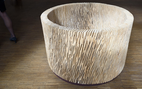
Lichter Raum - light room

Same exhibition (see preceding post), next room, and again: a sculpture and a title referring to "light".
This time made from poplar wood by Joseph Stephan Wurmer in 2013.
The sun was behind the clouds in this shot which helped reduce my own shadow on the sculpture. The shadows cast by the window behind me still helped frame the object. And an interesting leg of a visitor walking away from the sculpture in the dark is a nice bonus, I think: gives you an impression of the size (65x115x115 cm).

Lichter_Raum_80500

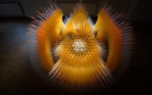
Sin Luz - without light

...is the title of the sculpture I shot at the exhibition of the NN-Kunstpreis. It is constructed from thousands of plastic dishes hold together by paper-clips by Frank Dimitri Etienne. With 2.8m in diameter it's pretty large.
Interestingly (and luckily) the sun was shining right onto the sculpture and what I captured in my shot is one of the first impressions I got when I entered the room: fascinating, like an alien deep sea fish. Funnily the sculpture would have been pretty dull without light, so its title "Sin Luz" is a bit of a misnomer.

Sin_Luz_80489

As always in my Blog you can click on the images to view a large version. Enjoy!

January 04, 2015

Visit Gerhard Richter

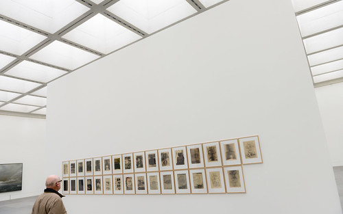
Just came back from the exhibition "Ausschnitt" (probably best translated in this context with "Extract") in the Neue Museum in Nuremberg. It shows a good selection of Gerhard Richter's work starting with a series of 31 monotypes (prints) from 1957 (see below) and 27 other images both figurative and abstract up until 2003. (As usual you can click through the images below to get to the large originals on flickr; just use "view all sizes" there).

Gerhard_Richter_73357

An interesting aspect of his work is that he often used photographies (his own or from magazines) as original from which he painted. These images show a characteristic haziness like a blurred photo, which makes it quite obvious that the images were painted after a photo and not after a real life scene.

Sometimes Gerhard Richter covered those photographic images with an abstract layer of paint with only parts of the "original" image shining through. All-in-all a very interesting discourse about photography and painting making you think about the relationship of both art-forms.

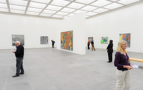
Here's another picture from the exhibition showing other works:

 Gerhard_Richter_73354

The exhibition is open until February 22nd. Highly recommended!

September 24, 2014

Another abstract one from Till Augustin

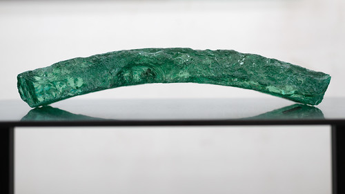
Till Augustin is working with glass in ways I've never seen before and this work has an intrinsic appeal to me. Perhaps it's the duality of the raw glass that he works with and the refined glass that finds its way into optical lenses on my camera...
Be that as it may: this work of him caught my eye and after doing a pretty boring shot angled from slightly above I caught this one that really shows off the beauty of this object:

Till_Augustin_70650

Now: this is really abstract!

September 21, 2014

"Auf AEG" again: 2014!

Really, really interesting for all lovers of contemporary art and photography: this weekend was the start but many exhibits and ateliers of the artists can be visited next weekane (27.+28 Sep) too and some are open until Oct. 5th. For more information see here or there.
Fpr photographers there is f/stop (hall 15, don't miss the upper floor!) and the Akademie Galerie by Jürgen Teller & students (hall 13).

Highly recommended!

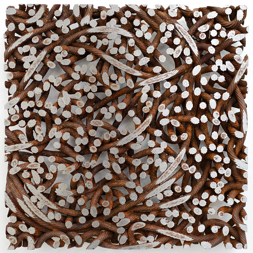
See an exhibit from one of my favorite artists, Till Augustin. He's mainly working with glass, rust and steel cables.

Till Augustin 70651


December 07, 2013

Twelve inches and twelve feet

Found another interesting pearl of wisdom in Kit White's "101 things to Learn in Art School" (The MIT Press, 2011) as lesson #65:
"A painting should be satisfying at a distance of both twelve inches and twelve feet.
 At the shorter distance, the facture* should establish the painting's integrity and be sensually satisfying. A confused or poorly constructed surface signals lack of command of the medium. At the greater distance, the composition of the whole needs to reveal itself as a convincing and meaningful assemblage of information. Rework the painting until it can pass this test."
---
* "facture": the quality of the execution of a painting; an artist's characteristic handling of the paint.
 Kit White accompanied this by an own image after Claude Monet.

Now, with photography you normally capture enough details to give more information to the viewers of your images that step up close enough. Whether that additional detail is satisfying is a completely different point. I generally find textures of a subject in a photograph interesting and satisfying so I normally tend to be one of those spectators that zoom in close on any image - be it a painting or a photograph.
What the specific charm about textures is I don't know. But I know that I mostly dislike images without such textural details: Some images of Jeff Coons just look like plain "painting-by-numbers" to me because they are devoid of brush-strokes and thus revealing no more details, no more passion, or any subtleties once you step closer.

September 25, 2012

And visit "auf AEG"!

If you're into modern art and live in the vicinity of Nuremberg/Erlangen/Fürth you should visit "auf AEG" until October 7th the latest. We spent 6 hours last Sunday because the studios of the artists were open and still did not see everything: Gigantic!
Some of the artists are into photography but I found that also many modern painters can give us photogs some relevant and interesting view on ... well, viewing, and abstracticism!
There's also a photographic exhibition just across the street "auf Quelle" about the "Waldrand" (the edges and borders of woods/forests). I'm certainly going to visit this one as trees and woods are one of my most favorite subjects. And it's open until October 20th.
So hurry while you can ;-)
Here's the website to tell you everything about "auf AEG"

July 30, 2010

The Picture of Dorian Gray

"...it is a mistake to think that the passion one feels in creation is ever really shown in the work one creates. Art is always more abstract than we fancy. Form and colour tell us of form and colour - that is all."
(Quote from "The Picture of Dorian Gray" by Oscar Wilde, 1890)

I think this describes one of the most frustrating experiences every new photographer will have when they show their work around: Not everybody shares their enthusiasm for an image simply because the passion with (or in a wider sense: the context in) which the photo was taken was lost on the beholder.
There are two dangerous courses that result from such frustration:
- one tries to shoot what pleases the crowd; with the risk of becoming a copy-cat.
- one proclaims: "It is enough if I find this image beautiful" and risk to stop improving.
Both paths will not lead to the desired result: to evoke (or convey) feelings, or even passion through the artful use of form and color.

That inspires a nasty question: What is it in "abstract art" that evokes feelings?

I posted this on some forums but response was scarce. Someone ventured along the lines that something in the colors or forms of an abstract image evokes memories which are coupled with feelings. Perhaps not a bad guess. But that would mean that you as a photographer hardly have control over what feelings you evoke with abstract photos.
My theory is that abstract art relies more on the primary effectors of color and form. Like round forms are associated with the feminine, red is associated with warmth/love etc. You get my drift?
So it is indeed easier for the beholder to associate "things" with a more abstract image than with a very realistic, explicit photo that tunnels your thoughts quite strongly. Perhaps the same mechanism that makes many films of books a less satisfying experience for the reader of the book - because the explicit images in the film restrict the associations the reader of the book had or even contradict them.
So coming back to the quote from Oscar Wilde: It might just be a hint that the highest explicitness and realism in an image not necessarily evokes the most favorite response to it.
Erotic photography is certainly one example where this "insight" is considered a platitude.
And Bjørn Rørslett comes to mind with many intriguing images that are quite enigmatic. See for example his "Colours on Colours" gallery.

Anyone likes to comment?

---
Interesting reading: "OK... I just do not get it???"

May 13, 2010

Hommage a trois (3b): David Hockney

Thinking a bit more about my failure to find a "Hockneyish" reference in my own photographs, I stumbled across an older image that picks up on at least three aspects of his work
- it's huge: the original has almost 50 Mega-pixels and could easily be printed 3m high at 80 dpi
- it's stiched: a vertical panorama made from five single shots
- it's about trees and woods

Vertical Pano 2

I applied some tweaks to colors and contrast to abstractify the trees a little and emphasize the glow of the snow-white light. Stitching was done in PS4 with the photomerge function which gives a nice reference to the name of my blog: The image was produced by rotating the camera vertically for each shot taken and merging them together in post.
Thus: RotoMerge.

If you want to know how David Hockney "completed his biggest ever painting", have a look at this article.

May 11, 2010

Hommage a trois (4): Viggo Mortensen

Gotcha! You never thought that a hommage a trois could possibly refer to four artists, right? Well yes, it happened, after I skipped David Hockney and remembered the influence and inspiration that Viggo Mortensen gave.
So this post is just a place-holder for the work I'd like to show here and which will be uploaded soon.
I'll be back after a short break...

Hommage a trois (3): David Hockney

Weeeeeelll, I admit: I have no idea which of my photos picks up some theme/ideas/tricks from David Hockney.
But I'll scan the monograph on him once again...

---3 minutes later---

Aaah, while looking for the monograph on David Hockney I stumbled across another artist that my wife and me find very interesting: Viggo Mortensen of "Lord of the Rings" fame! Did you know that he is a painter and photography artist?

I have his books "Skovbo" with some very inspiring photographs of woods, also "Sign Language" and "Coincidence of Memory". For his artisitic (non-film) work have a look here and for his books there.


It was Viggo Mortensens photographs in the Miyelo series and his take on forests that somehow inspired me or my series on "one second shots". I'll show you some of the results in my next post.

See you!

May 09, 2010

Hommage a trois (2): Peter Doig

Peter Doig impressed me with his "blotting technique". He uses it to add structure and light to many of his images, like the blots of light in his cabin-series or to add some foreground like falling snow like in his image "Blotter". I remember an image where he almost hid the scene behind a curtain of blots or streaks. This adds a nice layer of abstraction to an image but also can have the effect of pulling the observer in - because you try harder to look through the front-layer.

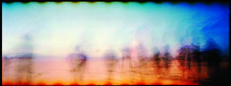
My tribute to his technique is this
Night Tree:
Night Tree 21030

I only used a gradient mask to desaturate the colors at the bottom and make the night-sky blue. But other than that there is not much post-processing going on in this image.
It is a photograph of ice on a canal with a tree-like crack in it and blotches of snow.

Enjoy!

Hommage a trois (1): Georg Baselitz

Well, Georg Baselitz is certainly not into geometric abstraction, but his famous trick was applied here: turn everything upside down.

Hommage a Baselitz 20822

And when you look closely at the lower left corner you can see my reference to this famous artist.
(As always: clicking through the image to the flickr-page and then selecting "All Sizes" gives you the chance to view this image larger)

May 08, 2010

Hommage a trois

I've been touching on abstract paintings and how I found some inspiration there.

In recent years I visited exhibitions of three modern painters:
- David Hockney: Images
- Peter Doig: Images
- Georg Baselitz: Images

Hockney is certainly the artist most closely linked to photography as he worked with photocollage, used photos as originals for his paintings, and played with perspective that seems clearly inspired by photography. I was also astonished seeing some of his larger works assembled from a multitude of canvasses, thus "stitching" huge vistas together. As a corollary his art is not too abstract as you can easily identify the subject of his images.

Doig has clearly some "photographic" influence in his work esp. with regard to light and shadow. I like his series "Concrete cabin" (see one from this series here) where the bright sunlight blotches the trees of a dense forest and a glaringly white concrete building is shining through the wood.

Baselitz perhaps is the odd artist here with regard to photography, but he is famous for his style of painting his subjects upside down and thus giving the observer a fresh perspective. This is somethings that works equally well in photography and is not even easy to detect: I once saw an abstract photography that was obviously based on wave-patterns on water. The artist had turned the image upside down and he admitted that I was the only one remarking on his trick.

April 18, 2010

About Abstract Art

Have a go at some interesting Wikipedia articles if you like to read what types of abstract art there are, e.g.:
- Abstract Art
- Geometric Abstraction
- Lyrical Abstraction
- Abstract Expressionism
You see from this that there are many, many styles of abstracticism. But rest assured, I'm not going to delve into these specialties.
Interestingly a search for "abstract photography" revealed not a single article at Wikipedia but only some hits in articles about individual photographers, like Morgan Fisher.
Mental note to myself: Someone has to have a go at that article.

Here are some interesting quotes from those Wiki articles:
"Figurative art and total abstraction are almost mutually exclusive. But figurative and representational (or realistic) art often contains partial abstraction."
"Abstraction indicates a departure from reality in depiction of imagery in art. This departure from accurate representation can be only slight, or it can be partial, or it can be complete. Abstraction exists along a continuum. Even art that aims for verisimilitude of the highest degree can be said to be abstract, at least theoretically, since perfect representation is likely to be exceedingly elusive."
The latter reference to "perfect representation" is interesting in that many photogs try to achieve just that by acquiring the latest and greatest technology.

Some buzzwords used to describe various abstract styles:
"Direct drawing", "calligraphic use of line", "brushed, splattered, stained, squeegeed, poured, and splashed paint", "brush-strokes", "compositional drama", "dynamic compositional tension", "compositional randomness", "repetition", "sensibility." But really, apart from the use of the words "paint" (which could be substituted by "color") and "brush" those catch-phrases could easily be from an article about photography.