
Showing posts with label Abstract. Show all posts
Showing posts with label Abstract. Show all posts
October 20, 2013
Rusty Landscape
Finally hit some nicely abstract subjects while looking through a burnt-down barn. This was a partially rusty metal plate. Which I don't see too often: either the metal is fully rusted or only afflicted at the edges. But lucky me....

September 29, 2012
An Artist's Palette
Fascinating how artists' palettes look like! I had the opportunity to have a look into some studios last weekend, when "auf AEG" opened the door. Palettes are the abstracts of any (painting) artist's images - because they only contain the colors of their images! And sometimes not even that: because the process of creating the color of an image is often done on the canvas and not on the palette.
Anyway I was intrigued by the palette of Anna Bittersohl and gave it a try: one of the colors alone and one showing them in the context of painting with brushes in the foreground. Still pretty abstract.


If you're interested in what Anna Bittersohl produced with those colors visit her website www.bittersohl.net and go to her work from 2012.
Anyway I was intrigued by the palette of Anna Bittersohl and gave it a try: one of the colors alone and one showing them in the context of painting with brushes in the foreground. Still pretty abstract.
If you're interested in what Anna Bittersohl produced with those colors visit her website www.bittersohl.net and go to her work from 2012.
February 21, 2012
Post #100
Well, just found out that this would be my 100th post on my blog dedicated to the abstract in photography.
So let's put away with lens-testing or with a little out-of-focus play and celebrate this with a suitably abstract image, aptly named
Transfiguration:

Now with me being a lens-tester and all everybody expects me to shoot brick-walls, hehe! But there are much more interesting targets: Siemens-stars for lens-testing and reflectively tiled walls for self-portraits. Yes, believe it or not, this is a "selfy" :)
Had to do some tweaking of the contrast with curves and remove some distracting blotches. But other than that it's almost straight out of the camera.
So let's put away with lens-testing or with a little out-of-focus play and celebrate this with a suitably abstract image, aptly named
Transfiguration:
Now with me being a lens-tester and all everybody expects me to shoot brick-walls, hehe! But there are much more interesting targets: Siemens-stars for lens-testing and reflectively tiled walls for self-portraits. Yes, believe it or not, this is a "selfy" :)
Had to do some tweaking of the contrast with curves and remove some distracting blotches. But other than that it's almost straight out of the camera.
November 09, 2011
Are photographs of abstract art abstract art?
I very much enjoyed my stay in Venice, where old meets new, modern art meets "classic art". Interestingly the question arises whether photographing abstract art in itself creates abstract art!? Naturally not, because a reproduction of someone else's art will never create art in itself. But...
What is a reproduction? Does a shot of a piece of abstract art constitute an "objet trouve"? Well, I'm pretty sure it depends. And as all this certainly contains some degree of self-reference I'm also pretty sure that if you do it "right" you could create some imagery that simply is publishable.
But enough of the theory, I just incidentally went on a tangent before presenting two images I captured because: they are images of other people's "art". We may now philosophize endlessly but in the end all that counts is: Are these images worth your time looking at it? I (at least) hope so. Enjoy!


But to come back to the initial question: Are photographs of abstract art abstract art? In this case I really don't think so. But "objet trouve"? Yeah, well, maybe ;-)
What is a reproduction? Does a shot of a piece of abstract art constitute an "objet trouve"? Well, I'm pretty sure it depends. And as all this certainly contains some degree of self-reference I'm also pretty sure that if you do it "right" you could create some imagery that simply is publishable.
But enough of the theory, I just incidentally went on a tangent before presenting two images I captured because: they are images of other people's "art". We may now philosophize endlessly but in the end all that counts is: Are these images worth your time looking at it? I (at least) hope so. Enjoy!
But to come back to the initial question: Are photographs of abstract art abstract art? In this case I really don't think so. But "objet trouve"? Yeah, well, maybe ;-)
July 30, 2010
The Picture of Dorian Gray
"...it is a mistake to think that the passion one feels in creation is ever really shown in the work one creates. Art is always more abstract than we fancy. Form and colour tell us of form and colour - that is all."
(Quote from "The Picture of Dorian Gray" by Oscar Wilde, 1890)
I think this describes one of the most frustrating experiences every new photographer will have when they show their work around: Not everybody shares their enthusiasm for an image simply because the passion with (or in a wider sense: the context in) which the photo was taken was lost on the beholder.
There are two dangerous courses that result from such frustration:
- one tries to shoot what pleases the crowd; with the risk of becoming a copy-cat.
- one proclaims: "It is enough if I find this image beautiful" and risk to stop improving.
Both paths will not lead to the desired result: to evoke (or convey) feelings, or even passion through the artful use of form and color.
That inspires a nasty question: What is it in "abstract art" that evokes feelings?
I posted this on some forums but response was scarce. Someone ventured along the lines that something in the colors or forms of an abstract image evokes memories which are coupled with feelings. Perhaps not a bad guess. But that would mean that you as a photographer hardly have control over what feelings you evoke with abstract photos.
My theory is that abstract art relies more on the primary effectors of color and form. Like round forms are associated with the feminine, red is associated with warmth/love etc. You get my drift?
So it is indeed easier for the beholder to associate "things" with a more abstract image than with a very realistic, explicit photo that tunnels your thoughts quite strongly. Perhaps the same mechanism that makes many films of books a less satisfying experience for the reader of the book - because the explicit images in the film restrict the associations the reader of the book had or even contradict them.
So coming back to the quote from Oscar Wilde: It might just be a hint that the highest explicitness and realism in an image not necessarily evokes the most favorite response to it.
Erotic photography is certainly one example where this "insight" is considered a platitude.
And Bjørn Rørslett comes to mind with many intriguing images that are quite enigmatic. See for example his "Colours on Colours" gallery.
Anyone likes to comment?
---
Interesting reading: "OK... I just do not get it???"
(Quote from "The Picture of Dorian Gray" by Oscar Wilde, 1890)
I think this describes one of the most frustrating experiences every new photographer will have when they show their work around: Not everybody shares their enthusiasm for an image simply because the passion with (or in a wider sense: the context in) which the photo was taken was lost on the beholder.
There are two dangerous courses that result from such frustration:
- one tries to shoot what pleases the crowd; with the risk of becoming a copy-cat.
- one proclaims: "It is enough if I find this image beautiful" and risk to stop improving.
Both paths will not lead to the desired result: to evoke (or convey) feelings, or even passion through the artful use of form and color.
That inspires a nasty question: What is it in "abstract art" that evokes feelings?
I posted this on some forums but response was scarce. Someone ventured along the lines that something in the colors or forms of an abstract image evokes memories which are coupled with feelings. Perhaps not a bad guess. But that would mean that you as a photographer hardly have control over what feelings you evoke with abstract photos.
My theory is that abstract art relies more on the primary effectors of color and form. Like round forms are associated with the feminine, red is associated with warmth/love etc. You get my drift?
So it is indeed easier for the beholder to associate "things" with a more abstract image than with a very realistic, explicit photo that tunnels your thoughts quite strongly. Perhaps the same mechanism that makes many films of books a less satisfying experience for the reader of the book - because the explicit images in the film restrict the associations the reader of the book had or even contradict them.
So coming back to the quote from Oscar Wilde: It might just be a hint that the highest explicitness and realism in an image not necessarily evokes the most favorite response to it.
Erotic photography is certainly one example where this "insight" is considered a platitude.
And Bjørn Rørslett comes to mind with many intriguing images that are quite enigmatic. See for example his "Colours on Colours" gallery.
Anyone likes to comment?
---
Interesting reading: "OK... I just do not get it???"
July 26, 2010
The bane of the modern viewfinder
You love the good, large, bright optical viewfinder (ovf) of a DSLR?
Sure you do!
You put your eye to the viewfinder and look at the scene you're about to capture in live-like size and with all the glorious detail. It looks like the real thing, like reality. The camera and its lens are transparent to you.
Much different from the ground glass in the finder of my Yashica-Mat 124G camera I once owned. It was a Twin Lens Reflex (TLR) and when you folded up the view-finder shield and looked down on the 6cm x 6cm ground glass the image projected there through the upper lens was looking much less like reality but like an artifact: It was small, it was mirrored vertically, it had grid-lines overlaid and the contrast was not too good under a bright sky. Even when you looked at it through the supplied loupe it was a far cry from the view through a modern ovf.
But it had one advantage: Your brain identified it easily as being an image, not reality. And that made it easier to compose because you saw important aspects of your composition faster than through an ovf. For example, the tilting lines you produce from tilting your camera upwards when shooting architecture just jump out at you when looking at the ground glass. Or the non-level horizon. The smallness of the screen also made important compositional elements like strong lines or large shadows stand out much more than the small details of the image. So you gave them automatically much more thought when shooting than when your eye is distracted by all the life-like details of an ovf.
So here's a case of pre-shoot abstractification that can help you take better photos because it helps your compositional skills. Even if you were to produce a most life-like image with glorious colors and sharp from corner to corner.
Today's DSLRs don't have something like this and unfortunately their standard matte screens don't even let you preview dof as it will turn out in the shot. Which is a real pity, because dof is one very important factor in composing a photo. And zooming in on the small screen on the back of todays DSLRs doesn't help to judge dof either.
Sure you do!
You put your eye to the viewfinder and look at the scene you're about to capture in live-like size and with all the glorious detail. It looks like the real thing, like reality. The camera and its lens are transparent to you.
Much different from the ground glass in the finder of my Yashica-Mat 124G camera I once owned. It was a Twin Lens Reflex (TLR) and when you folded up the view-finder shield and looked down on the 6cm x 6cm ground glass the image projected there through the upper lens was looking much less like reality but like an artifact: It was small, it was mirrored vertically, it had grid-lines overlaid and the contrast was not too good under a bright sky. Even when you looked at it through the supplied loupe it was a far cry from the view through a modern ovf.
But it had one advantage: Your brain identified it easily as being an image, not reality. And that made it easier to compose because you saw important aspects of your composition faster than through an ovf. For example, the tilting lines you produce from tilting your camera upwards when shooting architecture just jump out at you when looking at the ground glass. Or the non-level horizon. The smallness of the screen also made important compositional elements like strong lines or large shadows stand out much more than the small details of the image. So you gave them automatically much more thought when shooting than when your eye is distracted by all the life-like details of an ovf.
So here's a case of pre-shoot abstractification that can help you take better photos because it helps your compositional skills. Even if you were to produce a most life-like image with glorious colors and sharp from corner to corner.
Today's DSLRs don't have something like this and unfortunately their standard matte screens don't even let you preview dof as it will turn out in the shot. Which is a real pity, because dof is one very important factor in composing a photo. And zooming in on the small screen on the back of todays DSLRs doesn't help to judge dof either.
May 11, 2010
Hommage a trois (3): David Hockney
Weeeeeelll, I admit: I have no idea which of my photos picks up some theme/ideas/tricks from David Hockney.
But I'll scan the monograph on him once again...
---3 minutes later---
Aaah, while looking for the monograph on David Hockney I stumbled across another artist that my wife and me find very interesting: Viggo Mortensen of "Lord of the Rings" fame! Did you know that he is a painter and photography artist?
I have his books "Skovbo" with some very inspiring photographs of woods, also "Sign Language" and "Coincidence of Memory". For his artisitic (non-film) work have a look here and for his books there.
It was Viggo Mortensens photographs in the Miyelo series and his take on forests that somehow inspired me or my series on "one second shots". I'll show you some of the results in my next post.
See you!
But I'll scan the monograph on him once again...
---3 minutes later---
Aaah, while looking for the monograph on David Hockney I stumbled across another artist that my wife and me find very interesting: Viggo Mortensen of "Lord of the Rings" fame! Did you know that he is a painter and photography artist?
I have his books "Skovbo" with some very inspiring photographs of woods, also "Sign Language" and "Coincidence of Memory". For his artisitic (non-film) work have a look here and for his books there.
It was Viggo Mortensens photographs in the Miyelo series and his take on forests that somehow inspired me or my series on "one second shots". I'll show you some of the results in my next post.
See you!
May 08, 2010
Hommage a trois
I've been touching on abstract paintings and how I found some inspiration there.
In recent years I visited exhibitions of three modern painters:
- David Hockney: Images
- Peter Doig: Images
- Georg Baselitz: Images
Hockney is certainly the artist most closely linked to photography as he worked with photocollage, used photos as originals for his paintings, and played with perspective that seems clearly inspired by photography. I was also astonished seeing some of his larger works assembled from a multitude of canvasses, thus "stitching" huge vistas together. As a corollary his art is not too abstract as you can easily identify the subject of his images.
Doig has clearly some "photographic" influence in his work esp. with regard to light and shadow. I like his series "Concrete cabin" (see one from this series here) where the bright sunlight blotches the trees of a dense forest and a glaringly white concrete building is shining through the wood.
Baselitz perhaps is the odd artist here with regard to photography, but he is famous for his style of painting his subjects upside down and thus giving the observer a fresh perspective. This is somethings that works equally well in photography and is not even easy to detect: I once saw an abstract photography that was obviously based on wave-patterns on water. The artist had turned the image upside down and he admitted that I was the only one remarking on his trick.
In recent years I visited exhibitions of three modern painters:
- David Hockney: Images
- Peter Doig: Images
- Georg Baselitz: Images
Hockney is certainly the artist most closely linked to photography as he worked with photocollage, used photos as originals for his paintings, and played with perspective that seems clearly inspired by photography. I was also astonished seeing some of his larger works assembled from a multitude of canvasses, thus "stitching" huge vistas together. As a corollary his art is not too abstract as you can easily identify the subject of his images.
Doig has clearly some "photographic" influence in his work esp. with regard to light and shadow. I like his series "Concrete cabin" (see one from this series here) where the bright sunlight blotches the trees of a dense forest and a glaringly white concrete building is shining through the wood.

Baselitz perhaps is the odd artist here with regard to photography, but he is famous for his style of painting his subjects upside down and thus giving the observer a fresh perspective. This is somethings that works equally well in photography and is not even easy to detect: I once saw an abstract photography that was obviously based on wave-patterns on water. The artist had turned the image upside down and he admitted that I was the only one remarking on his trick.
May 07, 2010
Abstractification through B&W: Is it a conversion?
have a look at this photo:
Snowtree:

What's your bet: is it reproduced in (its natural) color(s) or is it a b&w conversion?
Well, I can tell you: there is not much of a difference here. This image was "converted" to b&w but it looked almost the same in color (after application of a suitable white-balance).
This is (again) a case where the artificial abstractification only emphasizes what is already in the picture. I think this is a major point if you like to abstractify photos without "overdoing" it.
The other interesting observation is the absence of gray. There is not much gray in the original image and I used no curves to separate blacks and whites any stronger. The only post-processing apart from the b&w-conversion was setting the blackpoint at around 64 (255 = white)
Snowtree:
What's your bet: is it reproduced in (its natural) color(s) or is it a b&w conversion?
Well, I can tell you: there is not much of a difference here. This image was "converted" to b&w but it looked almost the same in color (after application of a suitable white-balance).
This is (again) a case where the artificial abstractification only emphasizes what is already in the picture. I think this is a major point if you like to abstractify photos without "overdoing" it.
The other interesting observation is the absence of gray. There is not much gray in the original image and I used no curves to separate blacks and whites any stronger. The only post-processing apart from the b&w-conversion was setting the blackpoint at around 64 (255 = white)
May 02, 2010
(Curved) Glass and Patterns
Here are two examples I captured in Auckland. What astonished me most was the distorted reflections in the windows of the high-rise. This is an indicator of how curved the glass was and adds a nice layer of abstraction to this images.
Glasshouse:

Reflections:

Glasshouse:
Reflections:
Two Examples of Geometric Abstraction
If you look for it you can find some opportunities for creating (semi-)abstract images without the need to rely on any post-processing, reality-modifiers or camera-tricks. It's what I call abstract reality.
What do you need for this? Well, just the right subject, an interesting angle of view and the right framing. It works on the brain simply by taking away the 3rd dimension plus any well known reference-subjects depriving us of the sense of size and perspective. There are some classical examples from macro-photography, but the following image shows that extraordinary magnification is not necessary.
Rhythm:

If you recognize what this structure is the image does not seem too abstract at all. But I bet you did not often had a view like that. So how long did you take to identify this structure?
Here's another, very obviously called Grid:

I used b&w-conversion here to strengthen the sense of abstraction. I find myself often combining different methods for abstractification to achieve a greater overall effect. And it seems that certain images lend themselves more to one or the other method of abstractification but I have to think a little more about it and find some good examples (mental note to myself: reserve for future article)
Btw.: It is mere chance that both images are of man-made objects who's regularity lends the images a strong sense of geometry and pattern. So remembering my article About Abstract Art you could classify this as "geometric abstraction". Trying this with a natural subject tends to produce images more of the "lyrical abstraction" kind.
And another remark: Pattern can make for very interesting images, even if used in a very realistic context. A nice example is the winning image of the "CORRIDOR" challenge over at Nikongear. I'll come back to this in another post, combining reflections and pattern in high-rise buildings.
What do you need for this? Well, just the right subject, an interesting angle of view and the right framing. It works on the brain simply by taking away the 3rd dimension plus any well known reference-subjects depriving us of the sense of size and perspective. There are some classical examples from macro-photography, but the following image shows that extraordinary magnification is not necessary.
Rhythm:
If you recognize what this structure is the image does not seem too abstract at all. But I bet you did not often had a view like that. So how long did you take to identify this structure?
Here's another, very obviously called Grid:
I used b&w-conversion here to strengthen the sense of abstraction. I find myself often combining different methods for abstractification to achieve a greater overall effect. And it seems that certain images lend themselves more to one or the other method of abstractification but I have to think a little more about it and find some good examples (mental note to myself: reserve for future article)
Btw.: It is mere chance that both images are of man-made objects who's regularity lends the images a strong sense of geometry and pattern. So remembering my article About Abstract Art you could classify this as "geometric abstraction". Trying this with a natural subject tends to produce images more of the "lyrical abstraction" kind.
And another remark: Pattern can make for very interesting images, even if used in a very realistic context. A nice example is the winning image of the "CORRIDOR" challenge over at Nikongear. I'll come back to this in another post, combining reflections and pattern in high-rise buildings.
May 01, 2010
Abstractification through Camera Movement
Now today is the 1st of May and we should celebrate this with some colorful flowers, shouldn't we?
Here's an image of a rose I like very much:

I shot this with a 400mm lens at f/32, 1/6 sec, ISO 200. The 1/6 sec together with the large magnification of the lens allowed me to produce quite some motion-blur when I tried various camera-movements. The trick is to find the right movement that fits with the natural structure of your subject. In this case it was some sort of "drop-shift".
There is very little post-processing in this image. Just contrast enhancement plus some color-tweaking, as this technique reduces contrast and saturation.
When you look at the long exposure times you need in this kind of shot under bright sunlight you need one or more of the following:
- lens that can stop down to f/22, better f/32
- lowest camera-ISO of 200, better 100
- Neutral density filter (I did this without)
I've done most of my work of this kind hand-held with shutter speeds between 1/8 sec and 1 sec
Here's an image of a rose I like very much:
I shot this with a 400mm lens at f/32, 1/6 sec, ISO 200. The 1/6 sec together with the large magnification of the lens allowed me to produce quite some motion-blur when I tried various camera-movements. The trick is to find the right movement that fits with the natural structure of your subject. In this case it was some sort of "drop-shift".
There is very little post-processing in this image. Just contrast enhancement plus some color-tweaking, as this technique reduces contrast and saturation.
When you look at the long exposure times you need in this kind of shot under bright sunlight you need one or more of the following:
- lens that can stop down to f/22, better f/32
- lowest camera-ISO of 200, better 100
- Neutral density filter (I did this without)
I've done most of my work of this kind hand-held with shutter speeds between 1/8 sec and 1 sec
April 28, 2010
Abstractification through B&W Conversion (2)
The following image is a prime example of how b&w conversion emphasizes the nature of light in an image. This on is called
Morning Light:

There is also some contrast-tweaking with curves because the gradient in the contra-light is very subtle.
Taking this image in you may find it pretty realistic looking, although all colors are missing. Seems to relate quite well to the impression I had when standing there: in the strong contra-light and the slight mist colors really looked very subdued to the eye. The only exception being the green of the undergrowth.
Morning Light:
There is also some contrast-tweaking with curves because the gradient in the contra-light is very subtle.
Taking this image in you may find it pretty realistic looking, although all colors are missing. Seems to relate quite well to the impression I had when standing there: in the strong contra-light and the slight mist colors really looked very subdued to the eye. The only exception being the green of the undergrowth.
April 27, 2010
Abstractification through B&W Conversion (1)
Funny how the limitations of film in the early days made each photograph an abstract reproduction / object of abstract art: The color-palette of the original subject was replaced by a grey-scale and the use of colored filters to influence the reproduction/mapping of different colors to various shades of grey was commonplace.
Today most photos/videos are in color and a b&w conversion is a deliberate decision to take away the colors and thus abstractify the picture.
For me there are two major reason to use b&w: To emphasize form/gestalt over color and/or to increase the impact of light-gradation and thus emphasize the nature of light in an image.
I'll show you some examples in my next post.
Btw. Today most images are two-dimensional and not many people think of that as an abstraction from reality. But with the increasing use of 3D-techniques in the cinemas I’m pretty sure that in 50 years time 2-dimensionalty / taking away the depth of an image will count as abstraction too.
Today most photos/videos are in color and a b&w conversion is a deliberate decision to take away the colors and thus abstractify the picture.
For me there are two major reason to use b&w: To emphasize form/gestalt over color and/or to increase the impact of light-gradation and thus emphasize the nature of light in an image.
I'll show you some examples in my next post.
Btw. Today most images are two-dimensional and not many people think of that as an abstraction from reality. But with the increasing use of 3D-techniques in the cinemas I’m pretty sure that in 50 years time 2-dimensionalty / taking away the depth of an image will count as abstraction too.
April 25, 2010
Structured Glass
This shot of a cactus was done through the structured glass of a green house:

See how the structured glass makes the cactus look like under water or like aspic-preserved.
(as always, clicking on the image leads you to the flickr-page of the image where larger sizes can be accessed through the "All Sizes" button)
The effect is largely dependent on the distance of the subject from the glass. That's because the glass is such a strong modifier (at least compared to rain) that you'd reduce your subject to mush when you place it too far from the window.
See how the structured glass makes the cactus look like under water or like aspic-preserved.
(as always, clicking on the image leads you to the flickr-page of the image where larger sizes can be accessed through the "All Sizes" button)
The effect is largely dependent on the distance of the subject from the glass. That's because the glass is such a strong modifier (at least compared to rain) that you'd reduce your subject to mush when you place it too far from the window.
April 23, 2010
Abstractification through dof / oof
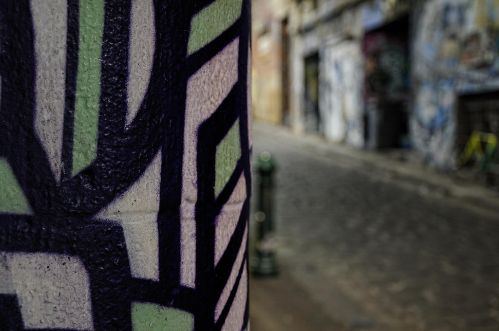
Funnily I just stumbled across an image with the title "post abstract expressionist impressionism" that shows pretty well, what dof/oof can do to abstractify your photos:

(c) arthurking83
You can follow the thread about this image here.
This shot is a nice example of mixing sharply depicted abstract graffiti and unsharp realistic scenes (the street) to produce a quite unique photo.
(c) arthurking83
You can follow the thread about this image here.
This shot is a nice example of mixing sharply depicted abstract graffiti and unsharp realistic scenes (the street) to produce a quite unique photo.
April 21, 2010
How to achieve Abstracticism
Let's make a little list about ways to abstractify photographs.
First up there are all the things you can do with post-processing. And I don't dare to list them all, because you can argue that in the end every tool apart form cropping/rotating is a step away from the most realistic representation of your subject. So instead I'll list the manipulations that I'd be using in my efforts to abstractify:
- B&W conversion
- Exposure compensation and curves
- Manipulating hue and saturation of colors
- Merging multiple exposures
And then there are the things you can do with your camera while taking the picture:
- Aperture: use large apertures to limit dof, reduce contrast, produce vignetting
- Focus: using mis-focus to deliberately produce oof results
- Exposure: over-/underexpose
- Shutter: use slow shutter speeds in connection with movement of subject (motion blur) and/or movement of the camera (shake, displace, rotate)
- Interaction of strong light with the lens resulting in flare/glare/ghosting, sunstars
- Lens effects: like from a fisheye, a lomo-camera*, from a lensbaby, or even from using no lens at all
There are also all kinds of capabilities of modern cameras like picture styles, multiple exposures, b&w conversions that can be done in-camera. But for the sake of simplicity I'd consider all this as post-processing as it does not influence the RAW image and normally can be far better controlled with software.
And finally there are all the options that lay outside the camera but influence the RAW image. Let's call them reality-modifiers:
- Filters and filter-like natural effects like haze/smoke/fog, rain/snow
- Reflection/refraction in "non-perfect" media like water, (curved) glass, metal, hot air
- extreme magnification or unusual/strange perspectives and framing can also yield quite some abstractification
All those reality-modifiers have in common that the effect can be seen with the naked eye (perhaps apart from extreme magnification).
I'd like to delve deeper into those abstractifiers in the upcoming posts and also post images to show the effect(s). And if you have other methods outside post-processing add those in a comment!
So, stay tuned...
---
*Here is a nice article about "How To Make Digital Photos Look Like Lomo Photography"
First up there are all the things you can do with post-processing. And I don't dare to list them all, because you can argue that in the end every tool apart form cropping/rotating is a step away from the most realistic representation of your subject. So instead I'll list the manipulations that I'd be using in my efforts to abstractify:
- B&W conversion
- Exposure compensation and curves
- Manipulating hue and saturation of colors
- Merging multiple exposures
And then there are the things you can do with your camera while taking the picture:
- Aperture: use large apertures to limit dof, reduce contrast, produce vignetting
- Focus: using mis-focus to deliberately produce oof results
- Exposure: over-/underexpose
- Shutter: use slow shutter speeds in connection with movement of subject (motion blur) and/or movement of the camera (shake, displace, rotate)
- Interaction of strong light with the lens resulting in flare/glare/ghosting, sunstars
- Lens effects: like from a fisheye, a lomo-camera*, from a lensbaby, or even from using no lens at all
There are also all kinds of capabilities of modern cameras like picture styles, multiple exposures, b&w conversions that can be done in-camera. But for the sake of simplicity I'd consider all this as post-processing as it does not influence the RAW image and normally can be far better controlled with software.
And finally there are all the options that lay outside the camera but influence the RAW image. Let's call them reality-modifiers:
- Filters and filter-like natural effects like haze/smoke/fog, rain/snow
- Reflection/refraction in "non-perfect" media like water, (curved) glass, metal, hot air
- extreme magnification or unusual/strange perspectives and framing can also yield quite some abstractification
All those reality-modifiers have in common that the effect can be seen with the naked eye (perhaps apart from extreme magnification).
I'd like to delve deeper into those abstractifiers in the upcoming posts and also post images to show the effect(s). And if you have other methods outside post-processing add those in a comment!
So, stay tuned...
---
*Here is a nice article about "How To Make Digital Photos Look Like Lomo Photography"
April 20, 2010
Abstractification through Rain
Picking up on my last post here's an image to show the effect of rain on a window-pane:

I don't like this image very much because the "hidden" subject is not very interesting but it gives you a nice demonstration of what you can achieve.
One thing to observe here (and I urge you to go to the flickr-page of this image by clicking on it and view it at larger sizes up to 1024x680) is the dependency of the effect on the viewing size: The smaller the size the clearer the background subject stands out. This is an issue that will come up time and again, as other effects of abstractification like dof/oof also heavily depend on the viewing-distance.
How did I get that shot?
- 150mm, f/16
- focus on the window
- distance from window approx. 2m
- distance to house approx. 100m
Normally you'll find that the distance between the rain-streaked window and the subject behind it is beyond your control. So to achieve the desired effect the most important variable is the distance from the window as it determines the relative size of the rain-streaks on the subject: the closer you get to the window the more prominent the streaks become. Next up is to choose the right focal length to frame the image correctly. And the last variable to influence the outcome is the aperture to determine how out-of-focus the subject behind the window is.
Well yes, there is also the decision on where to focus, but I found focusing not on the window-pane reduces the effect quite dramatically until - when you focus on the distant subject - the remaining effect looks like a small imperfection. Not really noticeable and more of a nuisance than an artistic effect.
So there are a lot of variables that greatly influence the outcome. Certainly a technique where you have to experiment quite a bit to achieve satisfying results.
Finally here's a crop from that same image to show you a close-up of the effect:

Btw.: using structured glass can achieve similar effects but normally lacks the randomness of rain.
I don't like this image very much because the "hidden" subject is not very interesting but it gives you a nice demonstration of what you can achieve.
One thing to observe here (and I urge you to go to the flickr-page of this image by clicking on it and view it at larger sizes up to 1024x680) is the dependency of the effect on the viewing size: The smaller the size the clearer the background subject stands out. This is an issue that will come up time and again, as other effects of abstractification like dof/oof also heavily depend on the viewing-distance.
How did I get that shot?
- 150mm, f/16
- focus on the window
- distance from window approx. 2m
- distance to house approx. 100m
Normally you'll find that the distance between the rain-streaked window and the subject behind it is beyond your control. So to achieve the desired effect the most important variable is the distance from the window as it determines the relative size of the rain-streaks on the subject: the closer you get to the window the more prominent the streaks become. Next up is to choose the right focal length to frame the image correctly. And the last variable to influence the outcome is the aperture to determine how out-of-focus the subject behind the window is.
Well yes, there is also the decision on where to focus, but I found focusing not on the window-pane reduces the effect quite dramatically until - when you focus on the distant subject - the remaining effect looks like a small imperfection. Not really noticeable and more of a nuisance than an artistic effect.
So there are a lot of variables that greatly influence the outcome. Certainly a technique where you have to experiment quite a bit to achieve satisfying results.
Finally here's a crop from that same image to show you a close-up of the effect:
Btw.: using structured glass can achieve similar effects but normally lacks the randomness of rain.
April 18, 2010
About Abstract Art
Have a go at some interesting Wikipedia articles if you like to read what types of abstract art there are, e.g.:
- Abstract Art
- Geometric Abstraction
- Lyrical Abstraction
- Abstract Expressionism
You see from this that there are many, many styles of abstracticism. But rest assured, I'm not going to delve into these specialties.
Interestingly a search for "abstract photography" revealed not a single article at Wikipedia but only some hits in articles about individual photographers, like Morgan Fisher.
Mental note to myself: Someone has to have a go at that article.
Here are some interesting quotes from those Wiki articles:
"Figurative art and total abstraction are almost mutually exclusive. But figurative and representational (or realistic) art often contains partial abstraction."
"Abstraction indicates a departure from reality in depiction of imagery in art. This departure from accurate representation can be only slight, or it can be partial, or it can be complete. Abstraction exists along a continuum. Even art that aims for verisimilitude of the highest degree can be said to be abstract, at least theoretically, since perfect representation is likely to be exceedingly elusive."
The latter reference to "perfect representation" is interesting in that many photogs try to achieve just that by acquiring the latest and greatest technology.
Some buzzwords used to describe various abstract styles:
"Direct drawing", "calligraphic use of line", "brushed, splattered, stained, squeegeed, poured, and splashed paint", "brush-strokes", "compositional drama", "dynamic compositional tension", "compositional randomness", "repetition", "sensibility." But really, apart from the use of the words "paint" (which could be substituted by "color") and "brush" those catch-phrases could easily be from an article about photography.
- Abstract Art
- Geometric Abstraction
- Lyrical Abstraction
- Abstract Expressionism
You see from this that there are many, many styles of abstracticism. But rest assured, I'm not going to delve into these specialties.
Interestingly a search for "abstract photography" revealed not a single article at Wikipedia but only some hits in articles about individual photographers, like Morgan Fisher.
Mental note to myself: Someone has to have a go at that article.
Here are some interesting quotes from those Wiki articles:
"Figurative art and total abstraction are almost mutually exclusive. But figurative and representational (or realistic) art often contains partial abstraction."
"Abstraction indicates a departure from reality in depiction of imagery in art. This departure from accurate representation can be only slight, or it can be partial, or it can be complete. Abstraction exists along a continuum. Even art that aims for verisimilitude of the highest degree can be said to be abstract, at least theoretically, since perfect representation is likely to be exceedingly elusive."
The latter reference to "perfect representation" is interesting in that many photogs try to achieve just that by acquiring the latest and greatest technology.
Some buzzwords used to describe various abstract styles:
"Direct drawing", "calligraphic use of line", "brushed, splattered, stained, squeegeed, poured, and splashed paint", "brush-strokes", "compositional drama", "dynamic compositional tension", "compositional randomness", "repetition", "sensibility." But really, apart from the use of the words "paint" (which could be substituted by "color") and "brush" those catch-phrases could easily be from an article about photography.
Next up
Just as a note to myself (and as an anchor to anyone wanting to suggests topics) here are some ideas for upcoming posts and other work:
- RotoMerge and Photomerge: On the (non-)use of tools
- Paintings: Adding my wife as another source of inspiration (Done, see here)
- Abstract: What is "abstract" all about (Done, see here)
- Keywords: Make a page to easily access posts by keywords/tags/labels (Done, see on the right under "Pages")
- RotoMerge and Photomerge: On the (non-)use of tools
- Paintings: Adding my wife as another source of inspiration (Done, see here)
- Abstract: What is "abstract" all about (Done, see here)
- Keywords: Make a page to easily access posts by keywords/tags/labels (Done, see on the right under "Pages")
Subscribe to:
Posts (Atom)