"...it is a mistake to think that the passion one feels in creation is ever really shown in the work one creates. Art is always more abstract than we fancy. Form and colour tell us of form and colour - that is all."
(Quote from "The Picture of Dorian Gray" by Oscar Wilde, 1890)
I think this describes one of the most frustrating experiences every new photographer will have when they show their work around: Not everybody shares their enthusiasm for an image simply because the passion with (or in a wider sense: the context in) which the photo was taken was lost on the beholder.
There are two dangerous courses that result from such frustration:
- one tries to shoot what pleases the crowd; with the risk of becoming a copy-cat.
- one proclaims: "It is enough if I find this image beautiful" and risk to stop improving.
Both paths will not lead to the desired result: to evoke (or convey) feelings, or even passion through the artful use of form and color.
That inspires a nasty question: What is it in "abstract art" that evokes feelings?
I posted this on some forums but response was scarce. Someone ventured along the lines that something in the colors or forms of an abstract image evokes memories which are coupled with feelings. Perhaps not a bad guess. But that would mean that you as a photographer hardly have control over what feelings you evoke with abstract photos.
My theory is that abstract art relies more on the primary effectors of color and form. Like round forms are associated with the feminine, red is associated with warmth/love etc. You get my drift?
So it is indeed easier for the beholder to associate "things" with a more abstract image than with a very realistic, explicit photo that tunnels your thoughts quite strongly. Perhaps the same mechanism that makes many films of books a less satisfying experience for the reader of the book - because the explicit images in the film restrict the associations the reader of the book had or even contradict them.
So coming back to the quote from Oscar Wilde: It might just be a hint that the highest explicitness and realism in an image not necessarily evokes the most favorite response to it.
Erotic photography is certainly one example where this "insight" is considered a platitude.
And Bjørn Rørslett comes to mind with many intriguing images that are quite enigmatic. See for example his "Colours on Colours" gallery.
Anyone likes to comment?
---
Interesting reading: "OK... I just do not get it???"
July 30, 2010
July 28, 2010
The boone of the LCD-viewer
When I cursed the "transparency" of modern optical viewfinders (ovf) I forgot to tell you about one trick I constantly use to help me evaluate an image and abstract it from the fabulous realism of the ovf: I set my camera to black & white and high contrast!
That only helps evaluate an image post shot but it is at least better than relying on the ovf alone.
- The smallness of the display has a similar effect than the ground glass of the TLR: It makes you concentrate on larger (and important) forms and geometries of your image
- The b&w makes you concentrate on differences of brightness that are more important to the eye and brain than differences in color. Again emphasizing form (over color)
- The high contrast makes it easier to see whether exposure is correct as underexposed or overexposed areas stand out immediately.
In these last two points the DSLR can deliver more support for abstractification while shooting than a TLR.
Funny thing is that when I import all my RAW-images into Lightroom (I don't do jpgs in camera) they at first retain their b&w high contrast "development" and only loose it when Lightroom renders the RAWs with its built-in RAW-converter. And when I look at that process I often find the b&w version better than the color-version that appears after a little while.
That always gives me food for thought...
July 26, 2010
The bane of the modern viewfinder
You love the good, large, bright optical viewfinder (ovf) of a DSLR?
Sure you do!
You put your eye to the viewfinder and look at the scene you're about to capture in live-like size and with all the glorious detail. It looks like the real thing, like reality. The camera and its lens are transparent to you.
Much different from the ground glass in the finder of my Yashica-Mat 124G camera I once owned. It was a Twin Lens Reflex (TLR) and when you folded up the view-finder shield and looked down on the 6cm x 6cm ground glass the image projected there through the upper lens was looking much less like reality but like an artifact: It was small, it was mirrored vertically, it had grid-lines overlaid and the contrast was not too good under a bright sky. Even when you looked at it through the supplied loupe it was a far cry from the view through a modern ovf.
But it had one advantage: Your brain identified it easily as being an image, not reality. And that made it easier to compose because you saw important aspects of your composition faster than through an ovf. For example, the tilting lines you produce from tilting your camera upwards when shooting architecture just jump out at you when looking at the ground glass. Or the non-level horizon. The smallness of the screen also made important compositional elements like strong lines or large shadows stand out much more than the small details of the image. So you gave them automatically much more thought when shooting than when your eye is distracted by all the life-like details of an ovf.
So here's a case of pre-shoot abstractification that can help you take better photos because it helps your compositional skills. Even if you were to produce a most life-like image with glorious colors and sharp from corner to corner.
Today's DSLRs don't have something like this and unfortunately their standard matte screens don't even let you preview dof as it will turn out in the shot. Which is a real pity, because dof is one very important factor in composing a photo. And zooming in on the small screen on the back of todays DSLRs doesn't help to judge dof either.
July 24, 2010
Blur
Yeah, right: They finally got it!
Nikongear is putting up a challenge to post the best blurred photo here.
Join into the fray or stand by watching in amazement what blur can do to create visually interesting, even artistic images.
The only rule that all contestants should adhere to is "The blur needs to be on purpose though".
The challenge is open until August 8th. So hurry to participate if you think you have the guts to compete. I've already participated with my fav shot from my 1 second series.
So you're up against some strong competition ;-)
July 22, 2010
The Grid - any comments?
Looking at my flickr account I see one photo coming out on top when you count views.
The Grid:

This is a shot made while testing my new Nikon AF-S 50mm f/1.4 G. I used the lens fully open at f/1.4 trying to give a good impression of real-life sharpness and the dof-isolation and oof-rendering that you could produce with it.
I find the interplay of sharp geometric form in the foreground and colorful oof background quite interesting but didn't think much of this photo until I saw that it is almost every day my most viewed photo on flickr - racking up over 10,000 views up to now (the review had over 26,000 hits).
So now I'm wondering whether this is the ultimate test-photo luring the gear-heads to evaluate the qualities of this lens or has the image qualities of its own?
Well I guess it's a little of both reasons.
But I'd really love to hear from you what you think the (hidden) qualities of this photo are - or are not. Feel free to leave a comment! You don't even need to be registered to do so.
The Grid:
This is a shot made while testing my new Nikon AF-S 50mm f/1.4 G. I used the lens fully open at f/1.4 trying to give a good impression of real-life sharpness and the dof-isolation and oof-rendering that you could produce with it.
I find the interplay of sharp geometric form in the foreground and colorful oof background quite interesting but didn't think much of this photo until I saw that it is almost every day my most viewed photo on flickr - racking up over 10,000 views up to now (the review had over 26,000 hits).
So now I'm wondering whether this is the ultimate test-photo luring the gear-heads to evaluate the qualities of this lens or has the image qualities of its own?
Well I guess it's a little of both reasons.
But I'd really love to hear from you what you think the (hidden) qualities of this photo are - or are not. Feel free to leave a comment! You don't even need to be registered to do so.
July 21, 2010
Imagination vs. Reality
"Photography is the expression of imagination, not the duplication of reality."
This is a quote from an article by Ken Rockwell dubbed "The pen and your signature". He brings home the message that the photographer is much more important than the camera, a point Ken has made many times before. And he is right!
This is the reason why I refrain from doing gear-talk on my blog, although I'm a gear-head myself and indulge in scrutinizing every review of photographic gear - even doing reviews by myself. But that is a totally different hobby from actually shooting images. But if you're actually interested in some of the gear I use or have tested, here's a list of reviews I did over at the friendly Camera Labs forum.
As you can see from some of the reviews I really struggled with some lenses and I'm still not sure whether I simply got a "lemon" (like the 85/1.8) or really have discovered something that others have overlooked. That makes testing a real nuisance and I limit it to lenses I actually intend to buy.
When I'm shooting I really like the gear to be "transparent", i.e. not to show up in the image unless I want it to. That's not because I want to duplicate reality. It's because I want to express my imagination and not expose the limitations of my gear!
July 19, 2010
Abstractification through Shadows
Another great "reality modifier" are shadows: They are monochrome, they reduce a subject to a silhouette and they might yield a geometric distortion depending on the angle of the projection surface and your angle of view.
Here is one of the experiments I did with my own shadow to produce a self-portrait:
Shadow of a lonely Man:

Funny thing is: Every time I look at this photo I believe it was taken at a very short focal length (a.k.a. wide-angle). But I'm wrong: It was shot with the AF-S 50mm/1.4 at f/16, 1/125 sec, ISO 200, -1EV.
Funny, how your eyes can deceive you...
Here is one of the experiments I did with my own shadow to produce a self-portrait:
Shadow of a lonely Man:
Funny thing is: Every time I look at this photo I believe it was taken at a very short focal length (a.k.a. wide-angle). But I'm wrong: It was shot with the AF-S 50mm/1.4 at f/16, 1/125 sec, ISO 200, -1EV.
Funny, how your eyes can deceive you...
July 18, 2010
Abstract Faces
When you can see something (like a face) in something quite different (like wood) you are onto some type of abstractification that I had not mentioned in my articles so far.
You may call this symbolism, ok, but in the end it is some form of abstracticism: You find a means to express the idea or basic form of a face from something that is not a face! Have a look at the following images:
Wooden Face I:

Wooden Face II:

The trick is of course to have something resembling eyes. The rest of the face might still be pretty alien - like in these two cases.
Further abstractification could be achieved through conversion to black&white to alleviate the impression of wood.
You may call this symbolism, ok, but in the end it is some form of abstracticism: You find a means to express the idea or basic form of a face from something that is not a face! Have a look at the following images:
Wooden Face I:
Wooden Face II:
The trick is of course to have something resembling eyes. The rest of the face might still be pretty alien - like in these two cases.
Further abstractification could be achieved through conversion to black&white to alleviate the impression of wood.
July 17, 2010
Paint and Rust II
Just wanted to add another to my "Paint and Rust" series. It's less colorful than the others but nonetheless interesting. It's called...
2,6:

The challenge with these image is to determine the right frame of the "original".
2,6:
The challenge with these image is to determine the right frame of the "original".
July 15, 2010
Sharp Flowers
Just in case you become dizzy with all this rotating and merging I thought to present a sharp image of a beautiful flower that is one of my favorites.
Flower:

Taken with a 105/2.8 macro-lens at f11, 1/20sec, ISO 200 on a tripod, directly in the evening sun. But although I used f/11 the curves and lines on the right side fade out of focus. I'm not sure whether this is a blemish or does not diminish the aesthetic quality of this image. Feel free to comment!
Flower:
Taken with a 105/2.8 macro-lens at f11, 1/20sec, ISO 200 on a tripod, directly in the evening sun. But although I used f/11 the curves and lines on the right side fade out of focus. I'm not sure whether this is a blemish or does not diminish the aesthetic quality of this image. Feel free to comment!
July 14, 2010
Wild Flowers
Other than with trees I tried my new technique also on blazing red summer flowers: Geranium and roses. I did not simply rotate the camera but made all kinds of "squiggly" moves with it to paint the beautiful red color all over the image.
The goal was again to capture the "spirit" of the flower.
See for yourself.
Geranium:

Rose I:

Rose II:

The real challenge was to get an exposure time that would record the movement of the camera. I used a 400/5.6 tele lens at f/32, ISO 200 and +2EV. With the sun out I achieved shutter times between 1/6 sec and 0.8 sec. And only the long focal length made it possible to record some serious blur with these times. People with ND-filters have a clear advantage here ;-)
Post-processing was minimal, just to bring exposure and contrast back to the normal range. Plus some cloning-out of dust-specks on the sensor that were clearly visible at f/32
The goal was again to capture the "spirit" of the flower.
See for yourself.
Geranium:
Rose I:
Rose II:
The real challenge was to get an exposure time that would record the movement of the camera. I used a 400/5.6 tele lens at f/32, ISO 200 and +2EV. With the sun out I achieved shutter times between 1/6 sec and 0.8 sec. And only the long focal length made it possible to record some serious blur with these times. People with ND-filters have a clear advantage here ;-)
Post-processing was minimal, just to bring exposure and contrast back to the normal range. Plus some cloning-out of dust-specks on the sensor that were clearly visible at f/32
July 12, 2010
Ghosting
Moving the camera through exposure on static subjects gives the impression of them moving and produces an ethereal ghostly image.
What would be better than to apply this technique to a (graffitied) ghost and produce an even more ghostly/ghastly image ;-)
Da Ghost:

You can really see him coming after you...
What would be better than to apply this technique to a (graffitied) ghost and produce an even more ghostly/ghastly image ;-)
Da Ghost:
You can really see him coming after you...
July 11, 2010
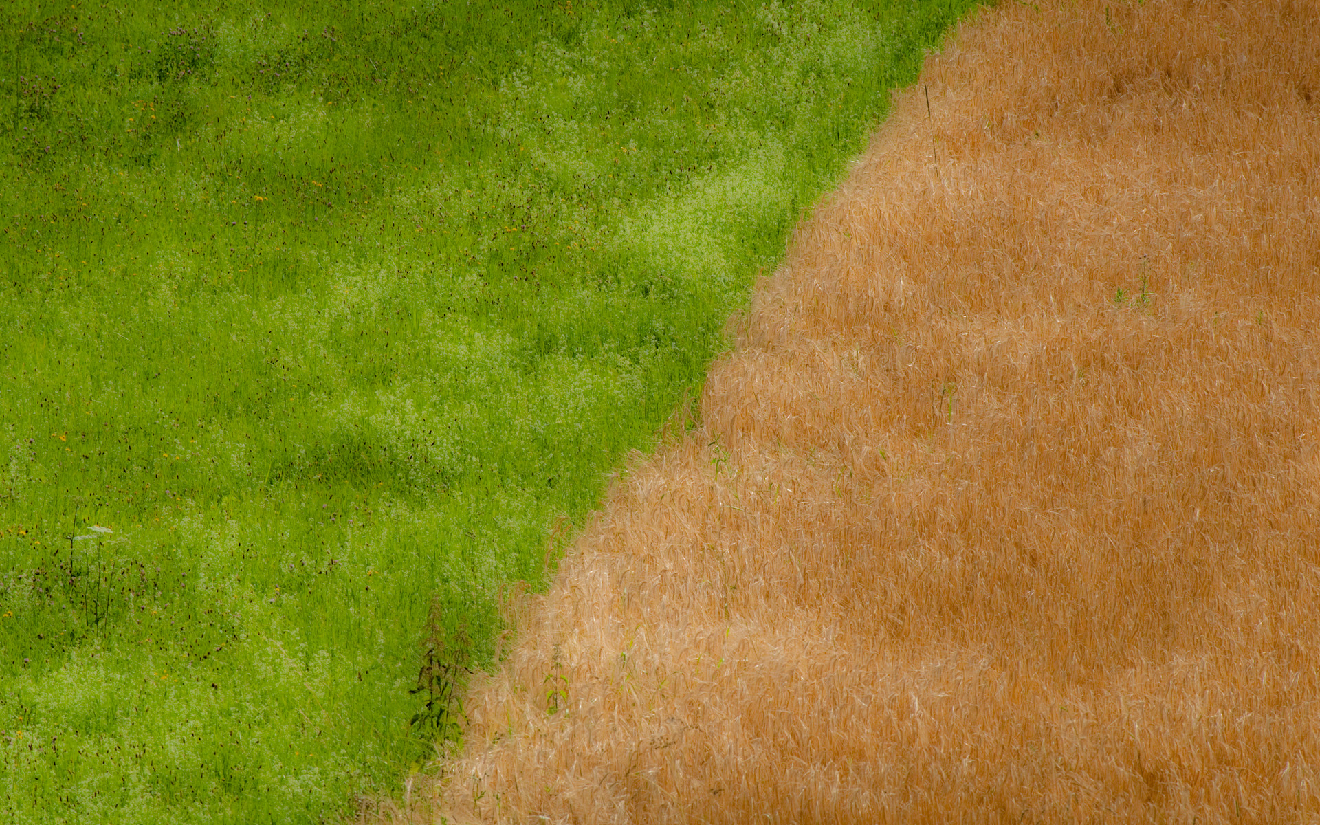
Textures
Today caught a view on two adjacent fields and tried to capture the colors and texture. But with a twist: I was after the "tuftiness" of the plants, not its graininess. So I reduced micro-contrast in post so that the individual plants look more like brush-strokes and the texture looks soft.
Just the way I like it...
Textures II:

This approach makes the image look uninteresting/dull in the small sizes you can present in a blog. I recommend viewing it full-screen on a 1920x1200 monitor and use the link here.
Shot with a 300/4.0 tele lens at f/11, 1/500 sec, ISO 280
Just the way I like it...
Textures II:
This approach makes the image look uninteresting/dull in the small sizes you can present in a blog. I recommend viewing it full-screen on a 1920x1200 monitor and use the link here.
Shot with a 300/4.0 tele lens at f/11, 1/500 sec, ISO 280
Subscribe to:
Posts (Atom)