April 13, 2014

Eliminate the nonessential

Found this in Kit White's "101 things to Learn in Art School" (The MIT Press, 2011) as lesson #89: "Every work of art should contain whatever it needs to fulfill its descriptive objective but nothing more. Look at the "leftover" parts of every composition. Successful images have no dead spaces or inactive parts. Look at your compositions holistically and make sure that every element advances he purposes of the whole"
---
Well, that seems a bit contrary to the essence of the last post about "slow revelation" of complex images: Shouldn't you arrive at a non-complex image if you "eliminate the nonessential"? Or to put it more positively: Shouldn't the concentration on the essential lead to simple(r) images that reveal themselves quickly? I simply find it hard in photography to shoot complex images that don't contain some nonessential parts.
And then there's also the question of what is nonessential! I discussed about a shot of a sculpture in front of a building: I had included a tourist taking a shot of the construct in my photograph and my wife didn't like it. She felt that the man was nonessential while I found that the inclusion of the photographer delivered (a) a sense of size and (b) was a nice contrast to the steel, concrete, and glass. But then I never really thought about what the image should convey.

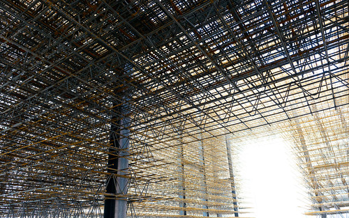
But some minutes before I took a shot from within the structure that had no persons wandering around it and no building in the background (the New Museum in Nuremberg) and i must admit, that after a while it was the image that I was most fond of. I think it has no nonessential elements in it and is quite complex - at least regarding the number of lines in it. Interestingly all the lines follow some basic geometry so the sculpture in itself creates an example of how you can combine complexity and simplicity. The sculpture is called "Unschärfe" (unsharpness) and built from reinforcing steel by Matthias Loebermann & the Institute for architecture and ...

Hope you like it!
Unschärfe 77319

April 08, 2014

Slow reveal

Found this in Kit White's "101 things to Learn in Art School" (The MIT Press, 2011) as lesson #55: Under the heading "Static images deliver the information they contain immediately" Kit White added: "But they have the capacity to reveal [...] over an extended period of investigation, meditation, and analysis. [...] And though the eye can take in an image in its totality in an instant, great images reveal their secrets slowly. The more complex an image, the slower the revelation" --- Kit White accompanied this by an own image after Paul Cezanne. Btw. kit White's lesson about slow reveal resonates well with his other lessen about images that "12 inches and 12 feet" here.

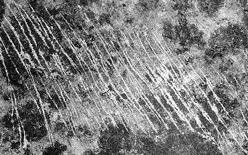
Scratch Marks

Scratches 77200 Converted to black and white to take away some clues as to what the subject really is and finding a crop that eliminated some of the more telling signs - which in this case were twigs and other debris. Now can you guess what it is? Well, an interesting stone that bore a lot of scratch marks!

February 15, 2014

Ghost of a tree

Back again to one of my fav subjects: At night this tree looked like a ghost. A little added vignette and a bit of a boost for the background to look like hellfire... Nightshadow_60534 Found this image unattended for in my collection when skimming for shots with the Nikon AF-S 35/1.4G. It's not the sharpest one shot at 1/30 sec handheld and at ISO 6400 - but I like it.

January 27, 2014

Not quite abstract

Normally I photograph trees for their beautiful and intriguing form. But sometimes a pattern or another aspect of trees catch my eye. This was the case here which looked like utter chaos with the young birches growing in an impenetrable thicket. The resulting geometry is one of mostly vertical lines in white and some ghostly criss-crossing twigs. Chaos, but with some structure. Abstract, but not quite unrecognizable. Birches 72379

December 07, 2013

Twelve inches and twelve feet

Found another interesting pearl of wisdom in Kit White's "101 things to Learn in Art School" (The MIT Press, 2011) as lesson #65:
"A painting should be satisfying at a distance of both twelve inches and twelve feet.
 At the shorter distance, the facture* should establish the painting's integrity and be sensually satisfying. A confused or poorly constructed surface signals lack of command of the medium. At the greater distance, the composition of the whole needs to reveal itself as a convincing and meaningful assemblage of information. Rework the painting until it can pass this test."
---
* "facture": the quality of the execution of a painting; an artist's characteristic handling of the paint.
 Kit White accompanied this by an own image after Claude Monet.

Now, with photography you normally capture enough details to give more information to the viewers of your images that step up close enough. Whether that additional detail is satisfying is a completely different point. I generally find textures of a subject in a photograph interesting and satisfying so I normally tend to be one of those spectators that zoom in close on any image - be it a painting or a photograph.
What the specific charm about textures is I don't know. But I know that I mostly dislike images without such textural details: Some images of Jeff Coons just look like plain "painting-by-numbers" to me because they are devoid of brush-strokes and thus revealing no more details, no more passion, or any subtleties once you step closer.

December 03, 2013

Testing again. No time for the abstract...

With the arrival of two new and interesting "normal" lenses I'm back to testing-mode. So no time for pursuing the abstract.
- The new lenses are the Nikon AF-S 58mm f1.4G with my review-in-progress up here.
- And the Zeiss 55mm F1.4 "Otus" which I have tested over there.
I know this is all excuses keeping me from shooting more - but that's how it is.
So if you're interested in the hardware-side head over to my thoughts on those two very interesting lenses.